
Perfect Pairings
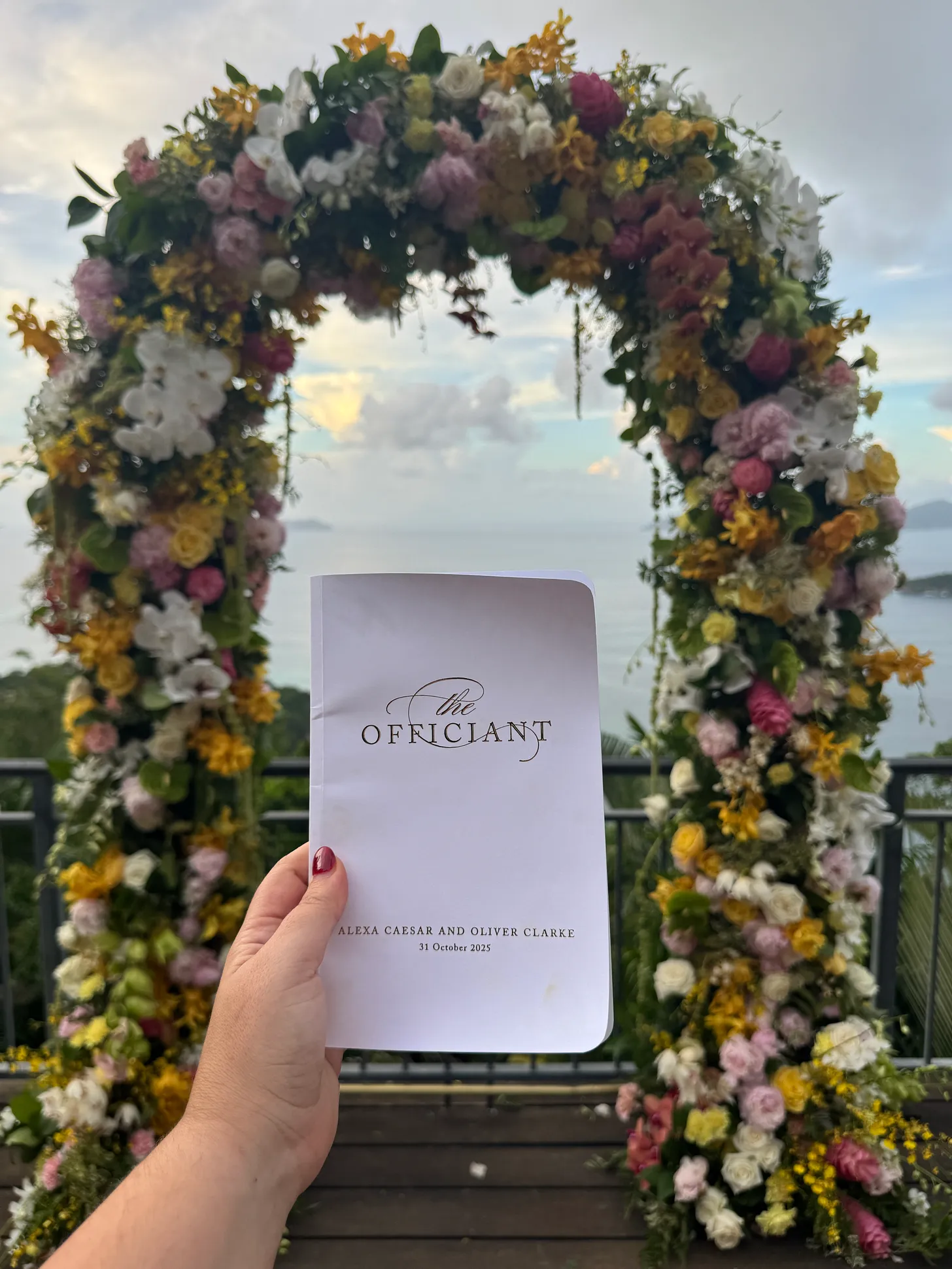
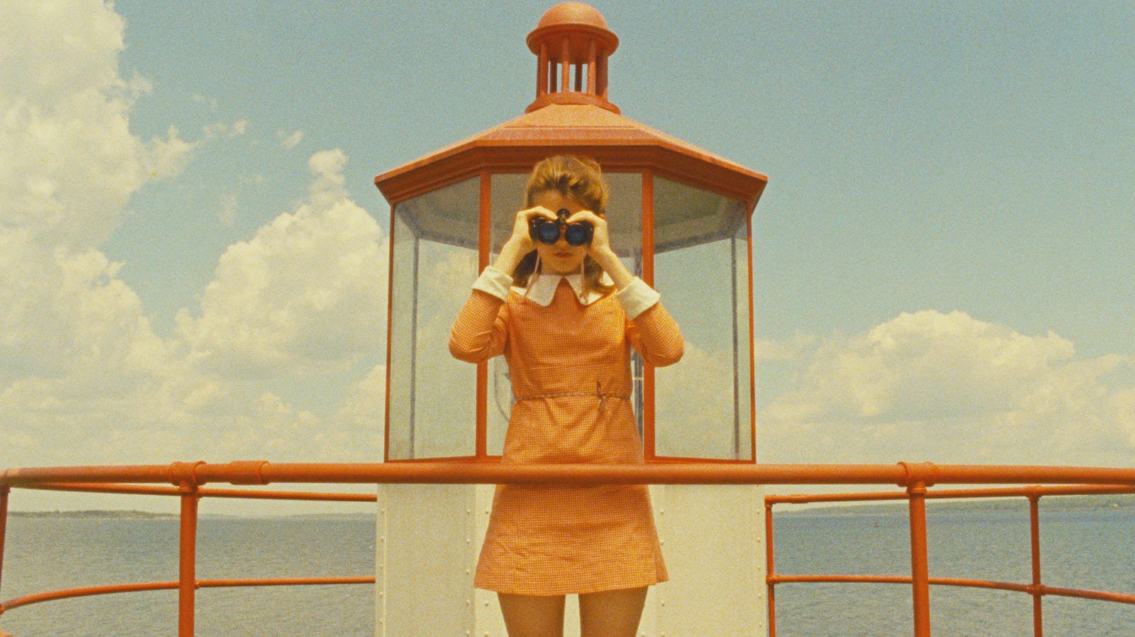
This weekend, I got to do something I’ll never forget: officiate the wedding of my best friend since I was five. The ceremony took place in the Virgin Islands, where the sea looked more painted than real—every shade of blue blending softly with the sky. But what stayed with me wasn’t the view; it was the way Alexa and her now husband, Oliver, fit together.
He runs a science research lab at Columbia. She just signed a full-time contract with the United Nations. One speaks in equations, the other in empathy. One thrives in structure, the other in story. And yet together, they make perfect sense. Their love is proof that difference, when held with curiosity, becomes design.
As I stood with them, I kept thinking about harmony—how love, like architecture, is built on tension done well. The most moving partnerships aren’t the ones that match; they’re the ones that meet.
The Geometry of Love
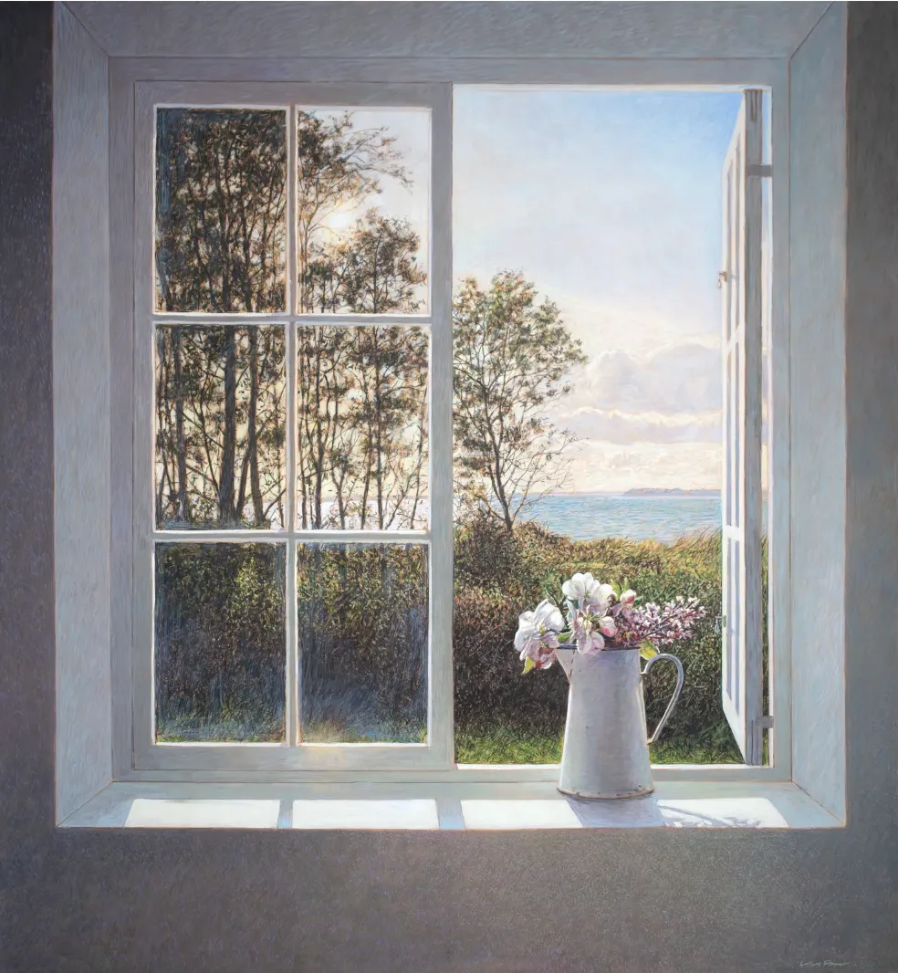
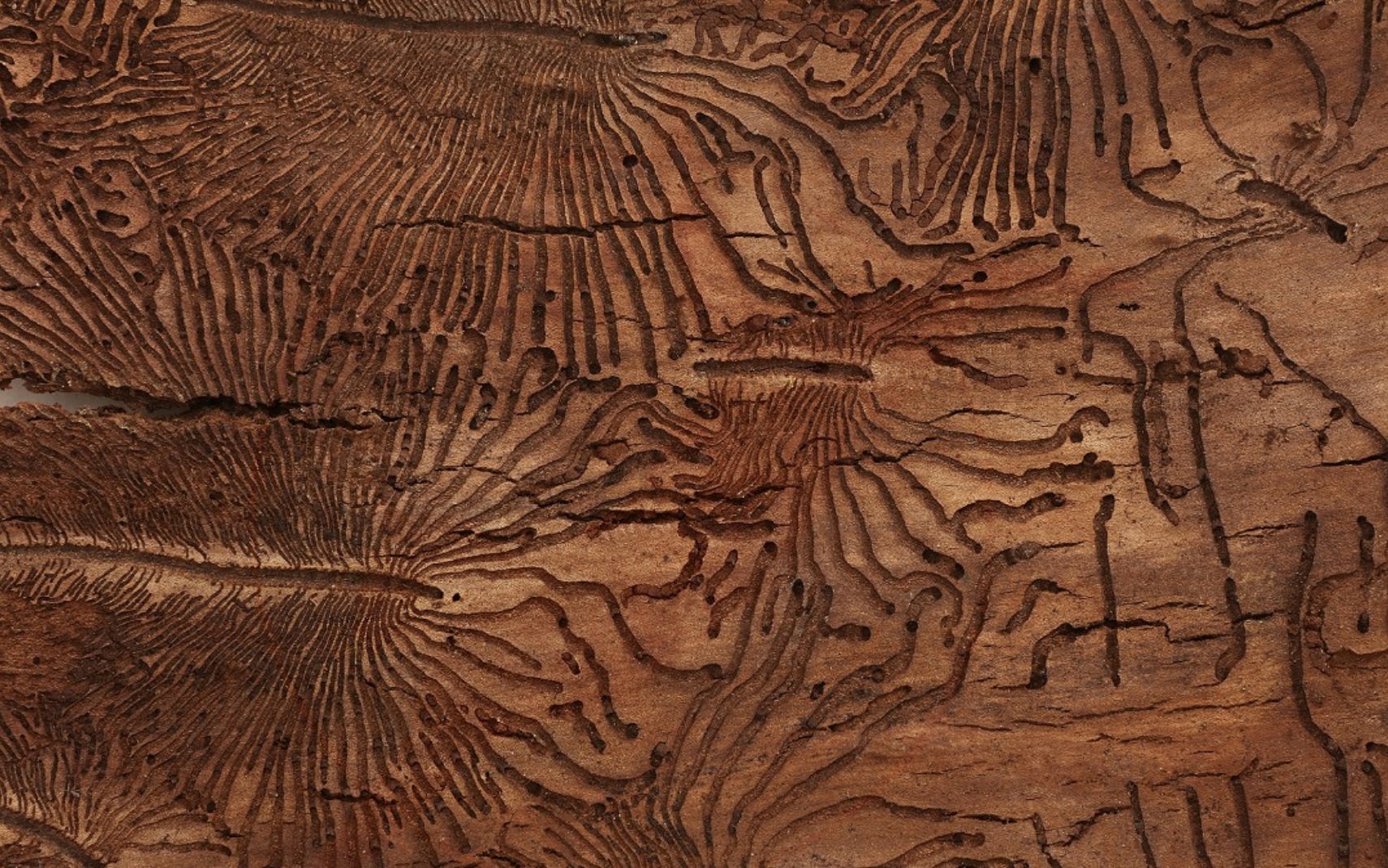
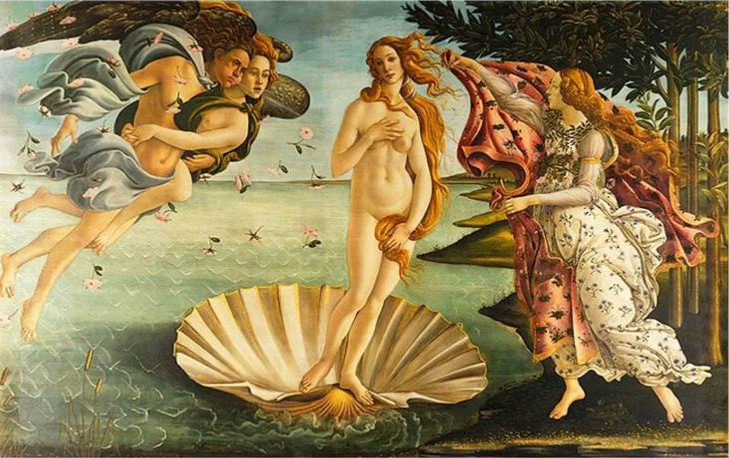
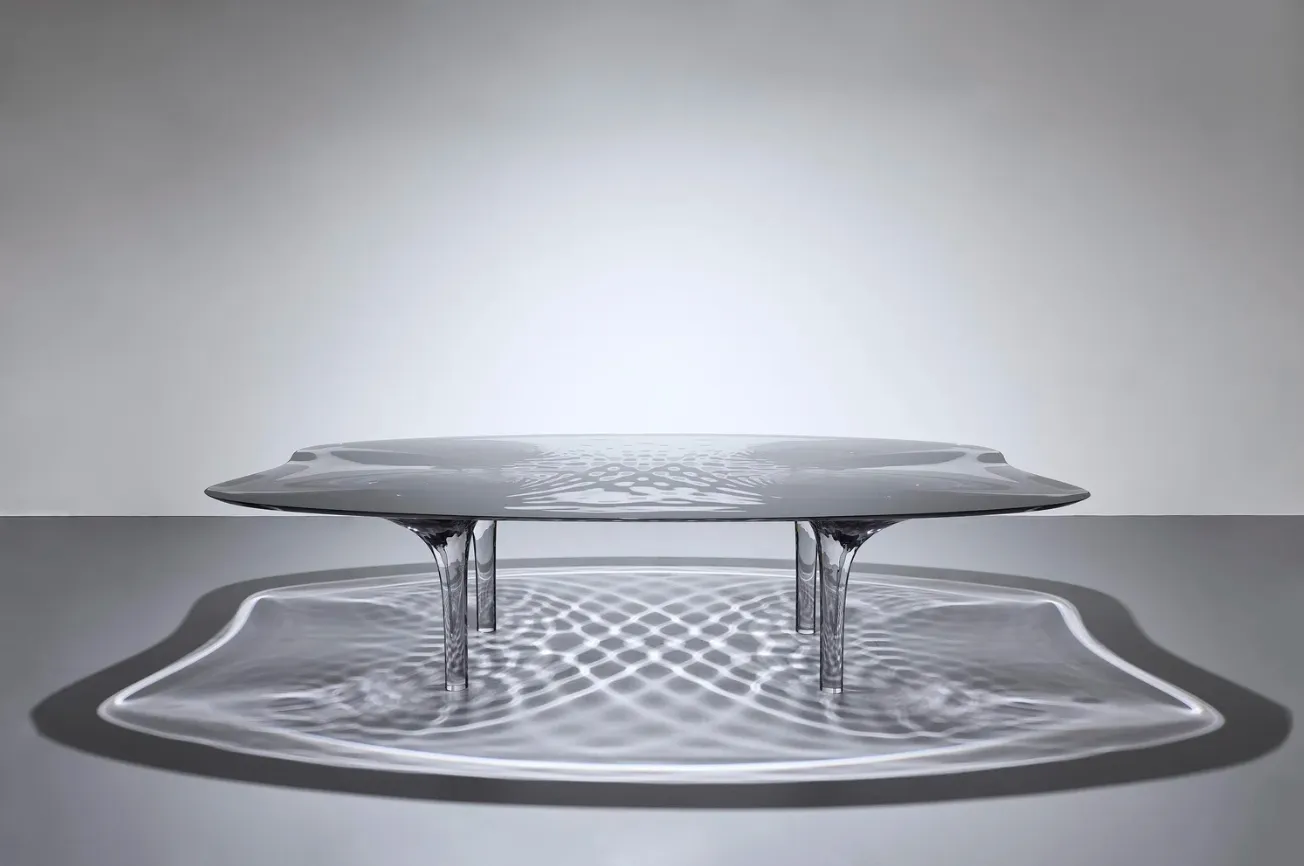
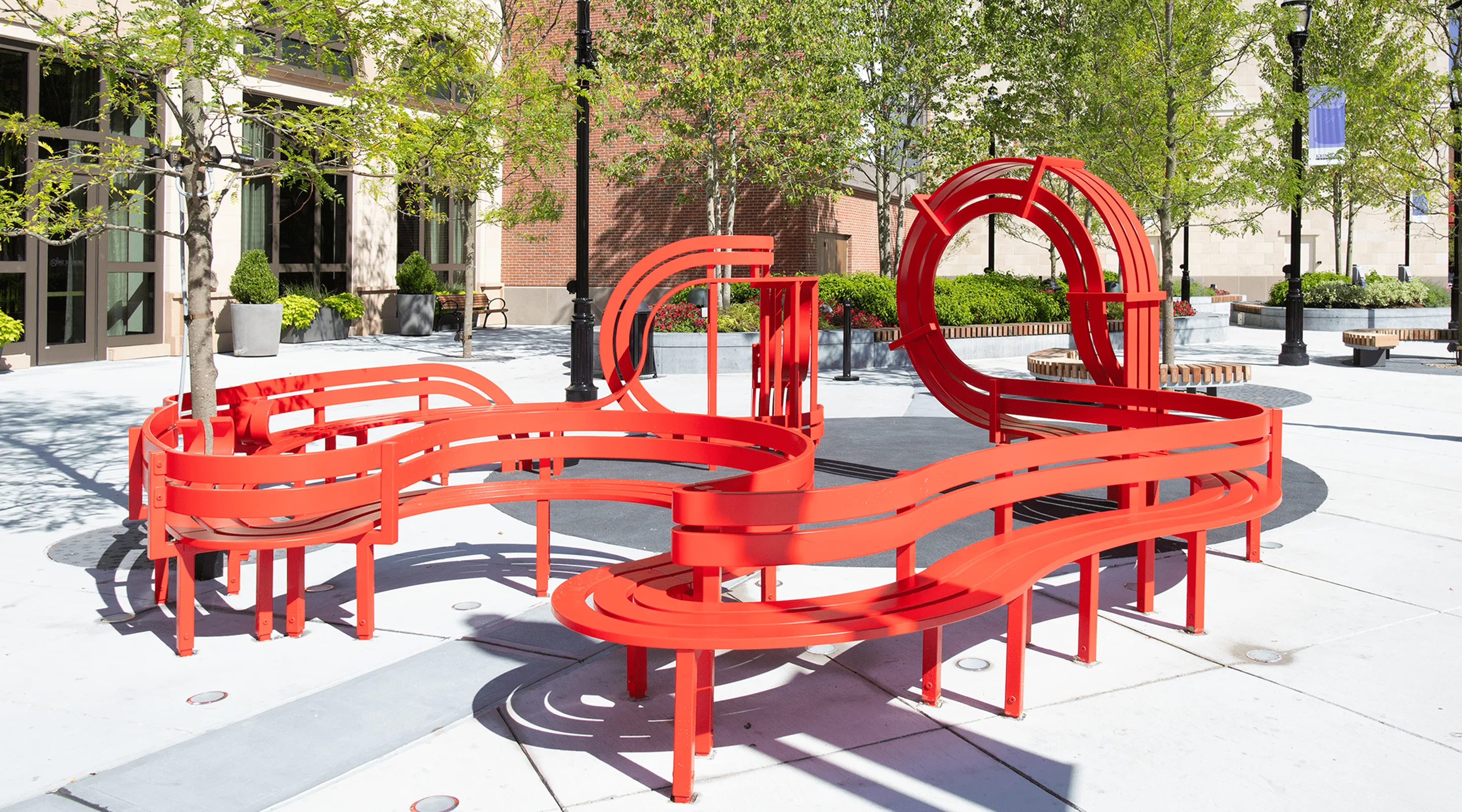
In design, opposites create rhythm. Curves need edges, light needs shadow, structure needs flow. The same applies to relationships. The beauty isn’t in symmetry—it’s in complement.
Alexa and Oliver thrive individually, but their union amplifies rather than dilutes who they are. Watching them exchange vows reminded me of balance in nature: how the tide needs both pull and release, how roots and sunlight are equally responsible for growth.
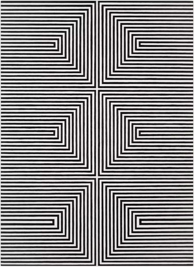
Love, at its core, is a geometry lesson—two shapes learning how to share a plane without losing their form.
Contrast as Chemistry
Since the wedding, I’ve been thinking about perfect pairings—the way contrast gives things life. You see it everywhere if you’re paying attention.
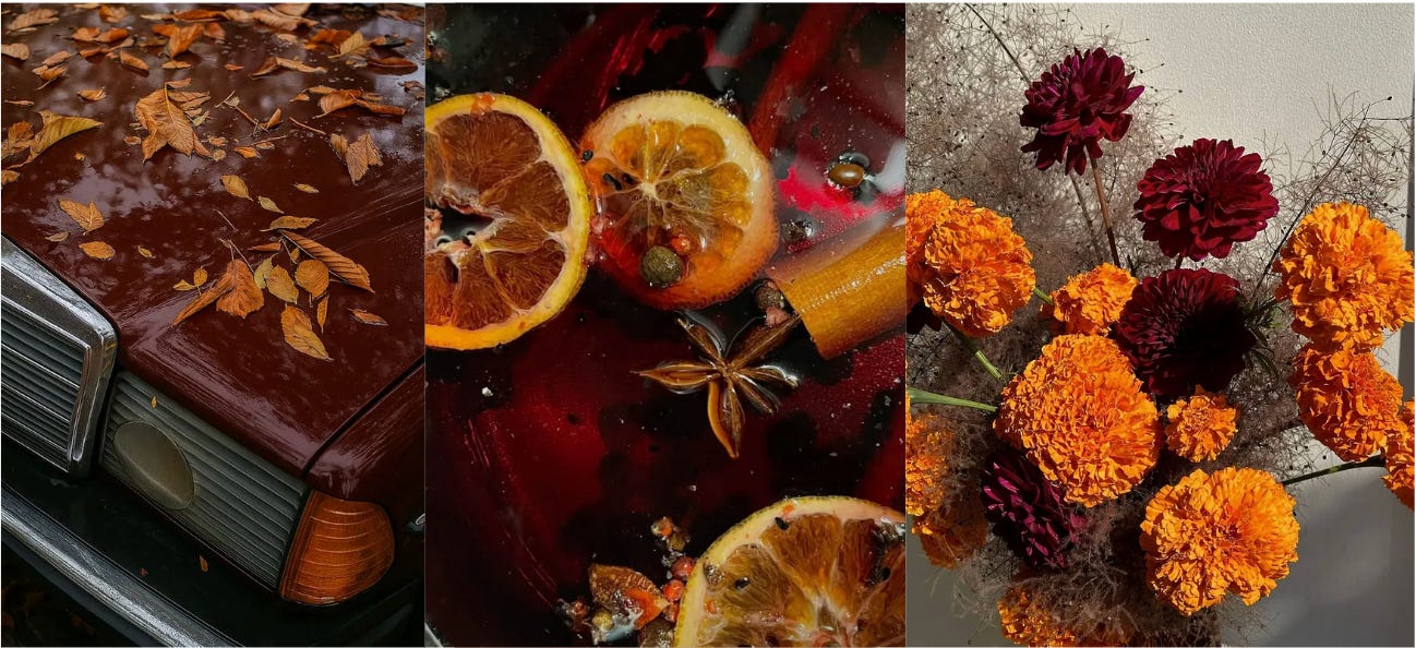
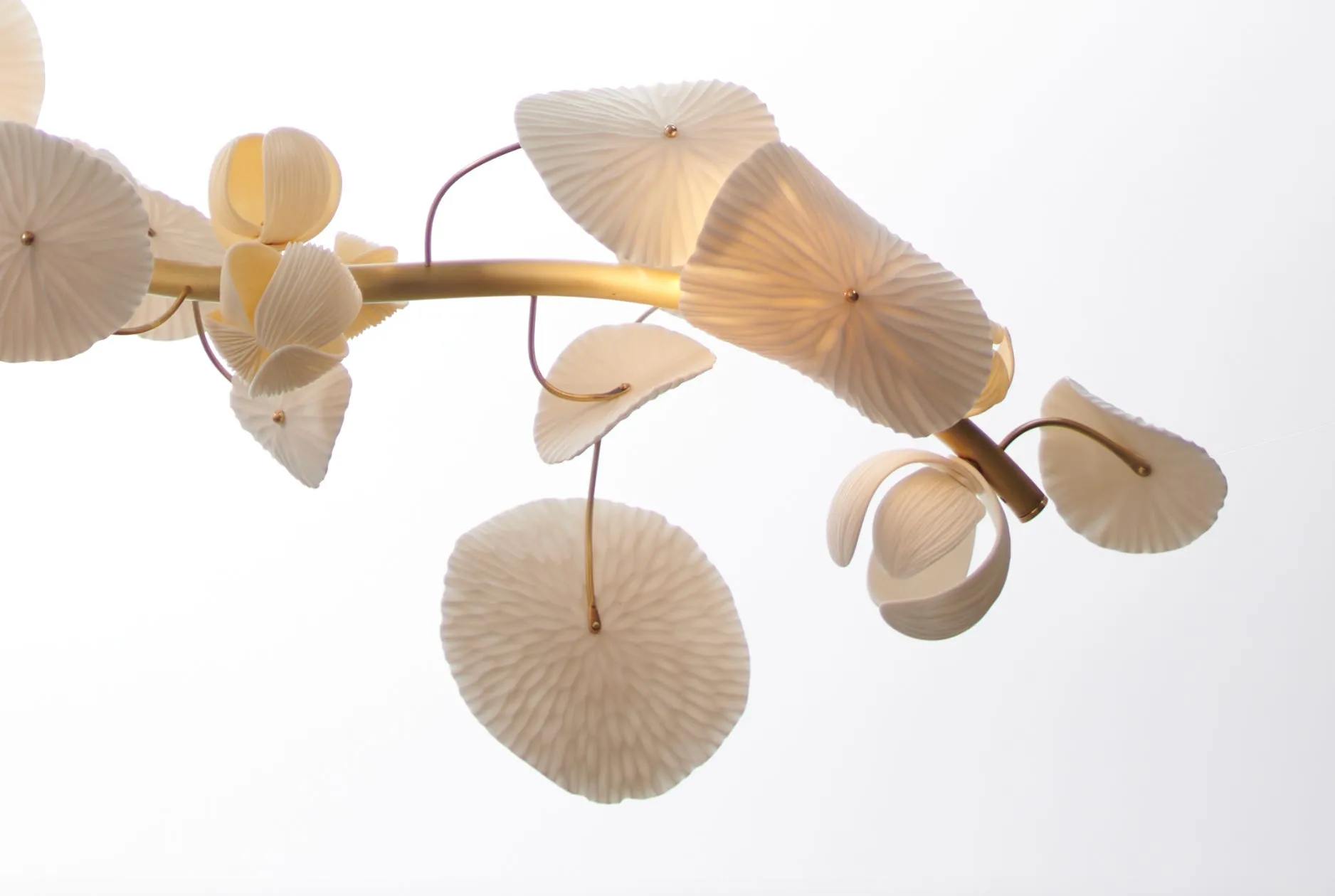
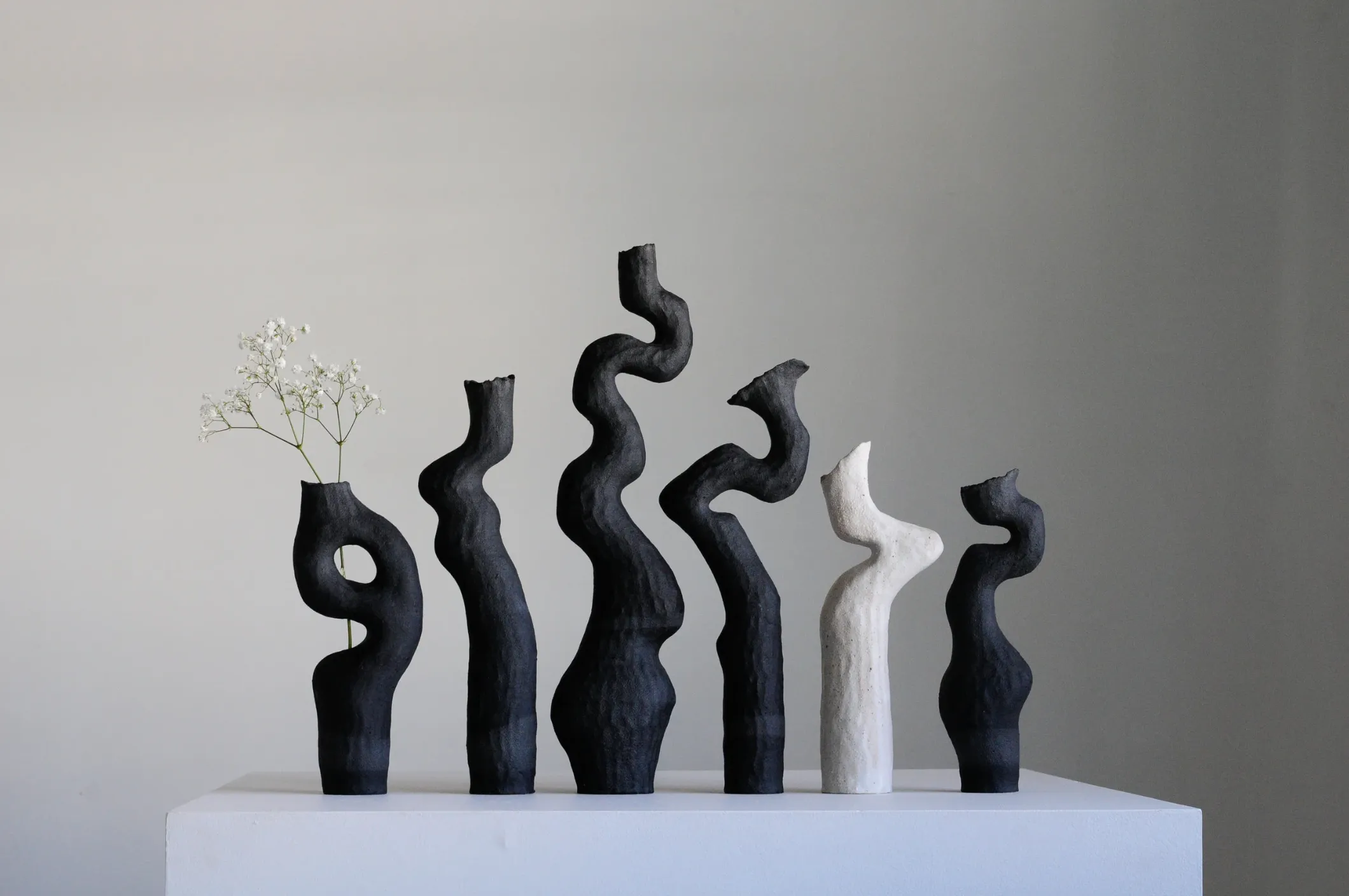
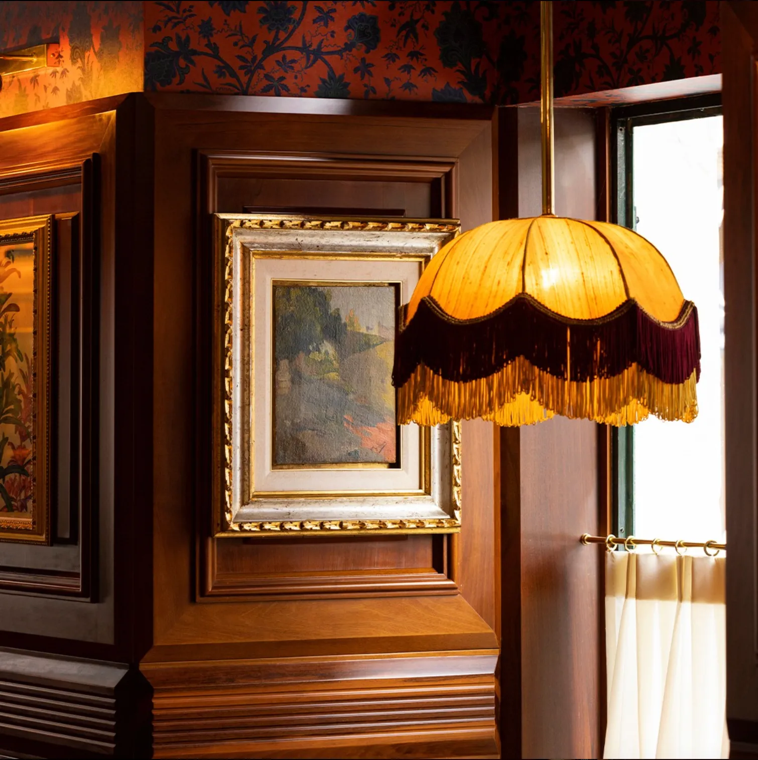
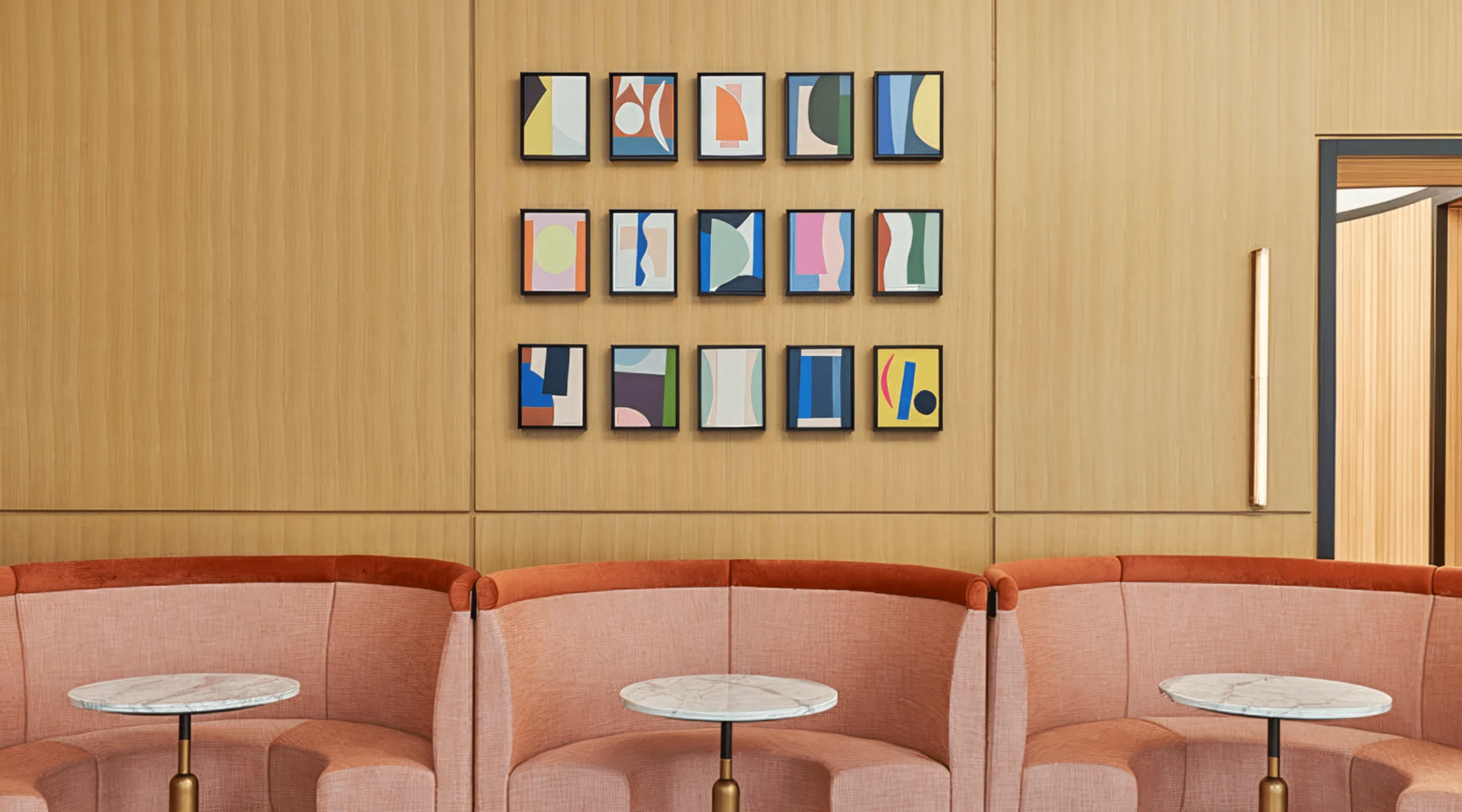
In color, opposites amplify each other. Deep Bordeaux and Burnt Orange. Citron and lilac. Magenta beside sage. Our eyes are wired to crave this kind of tension—when harmony lives right at the edge of difference.
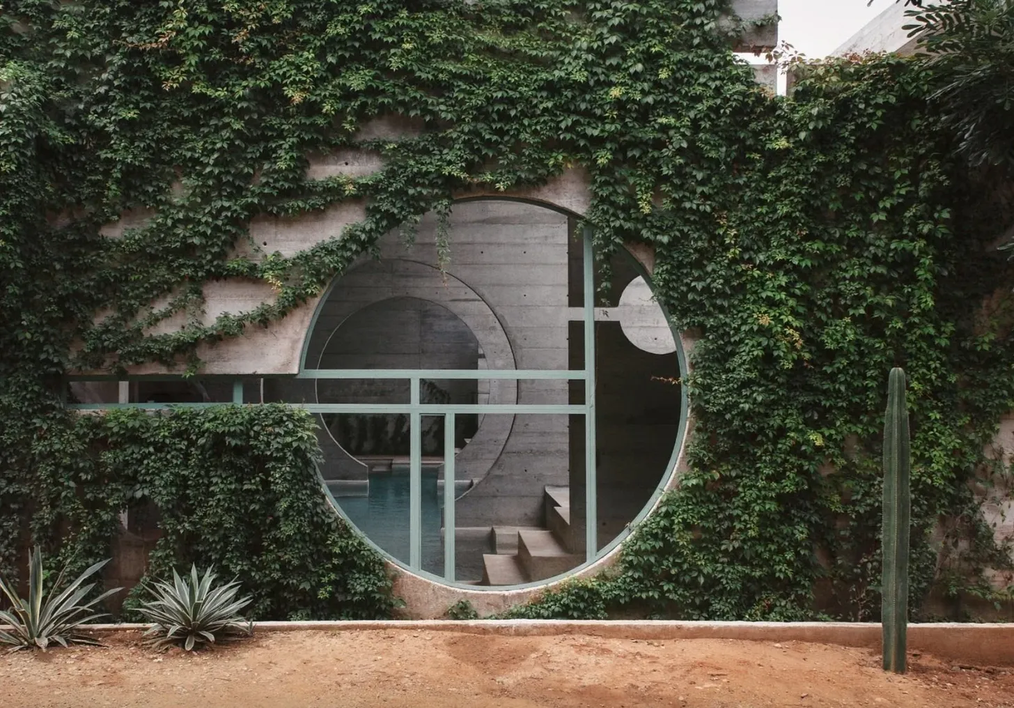
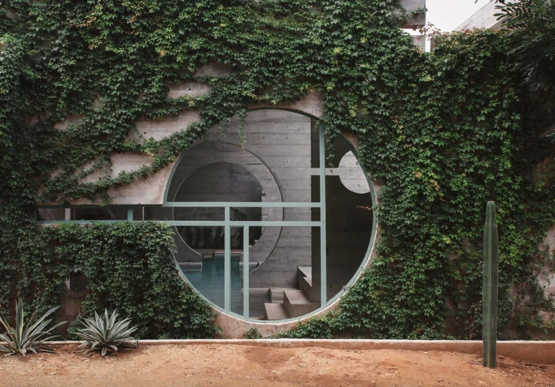
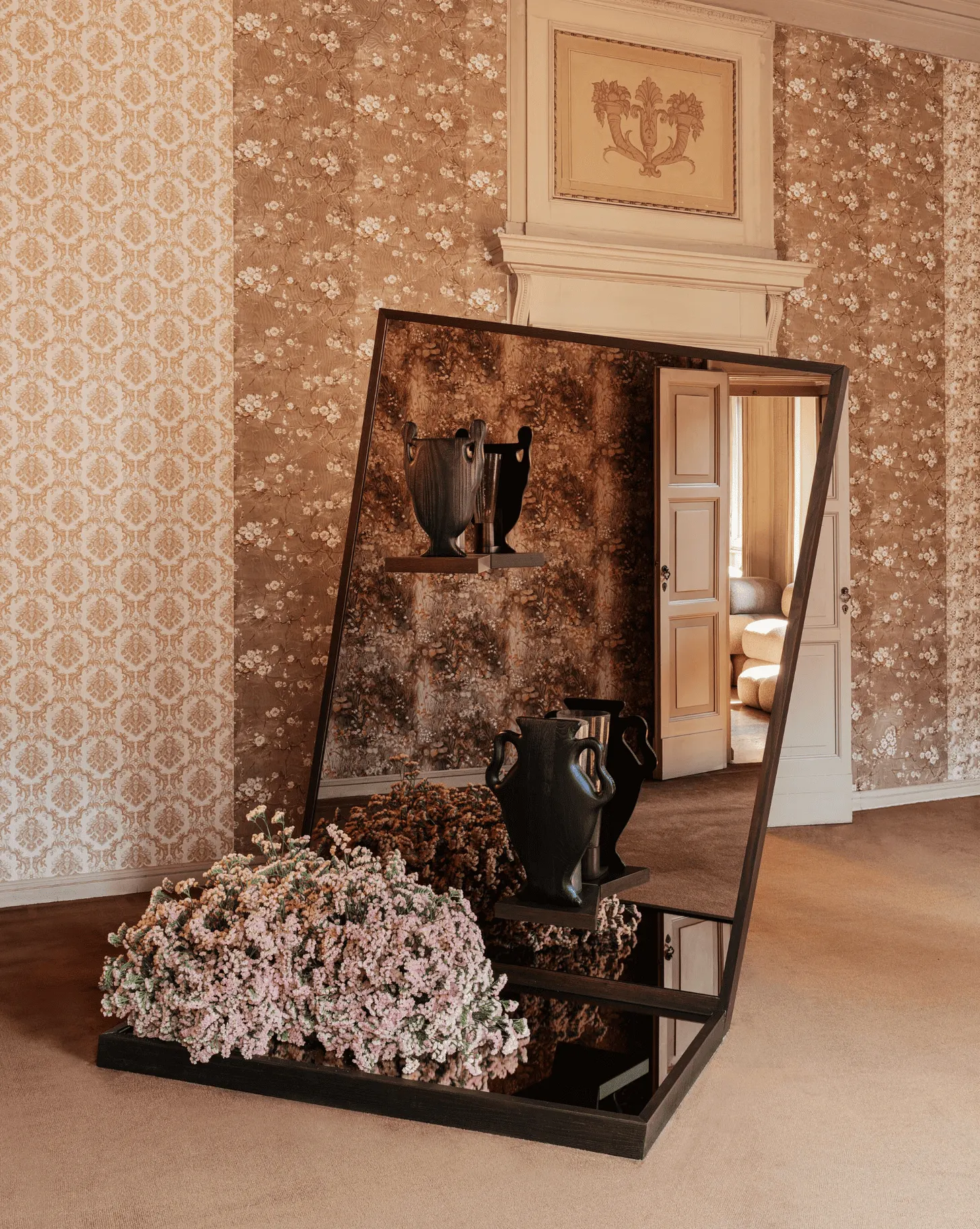
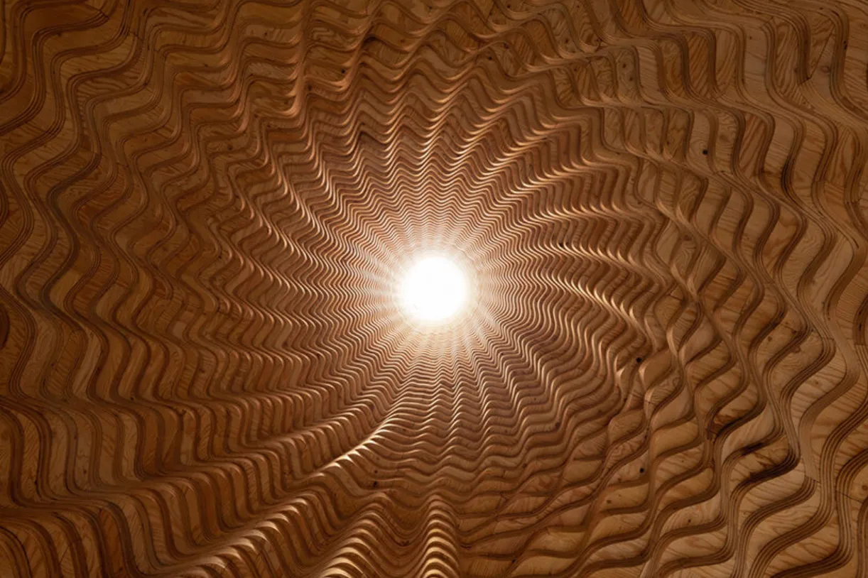
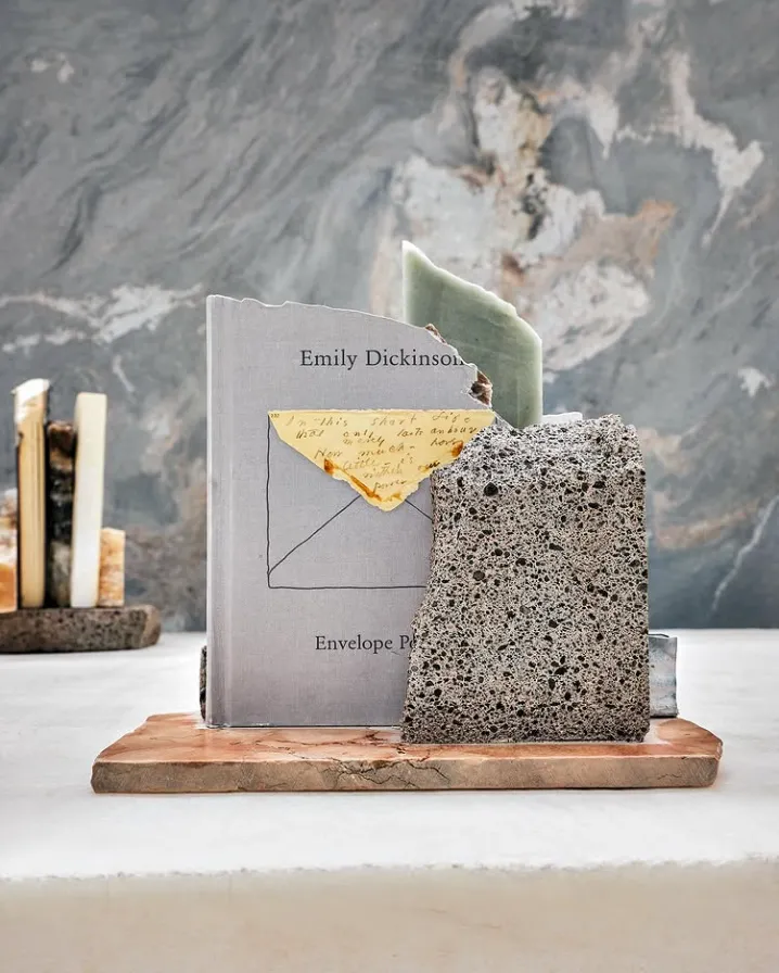
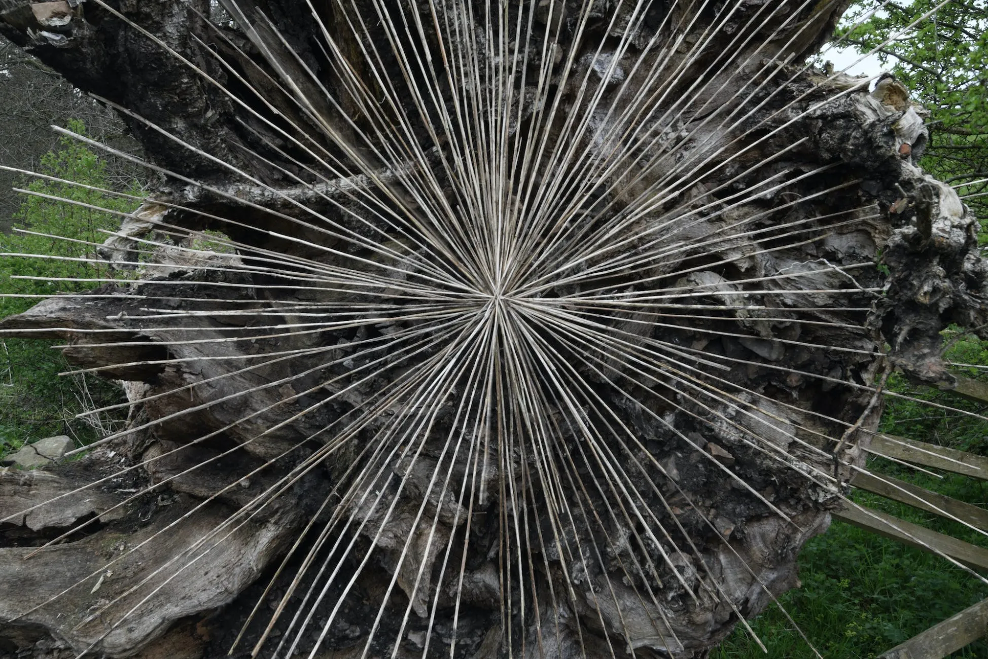
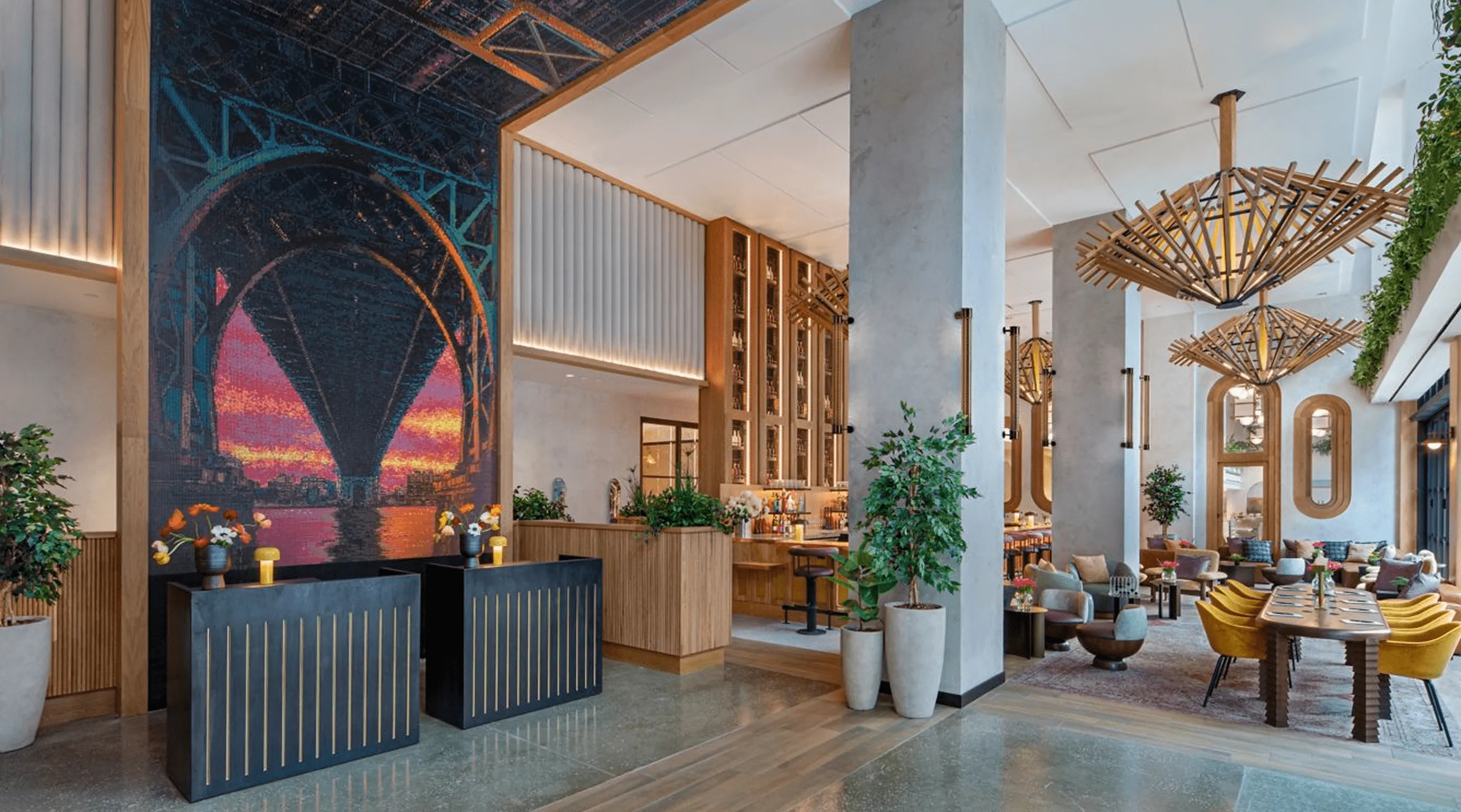
In Oaxaca, the design movement of eco-brutalism brings that same balance into built form: raw concrete walls softened by vines, steel meeting clay, geometry tempered by growth. It’s not conflict—it’s conversation. Structure holding nature, nature softening structure.
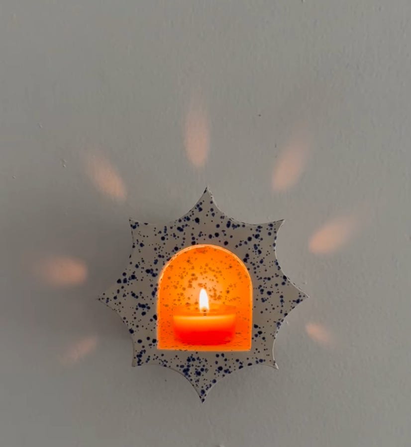
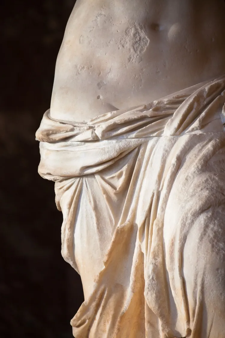
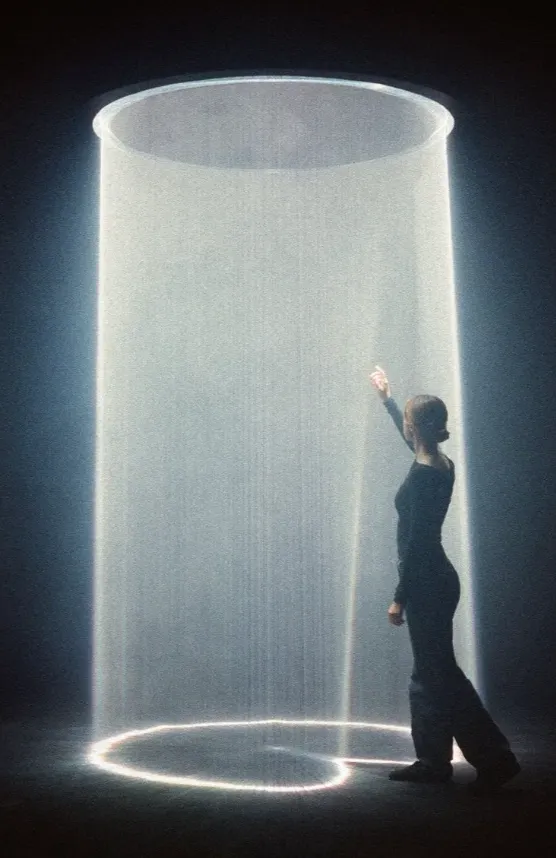
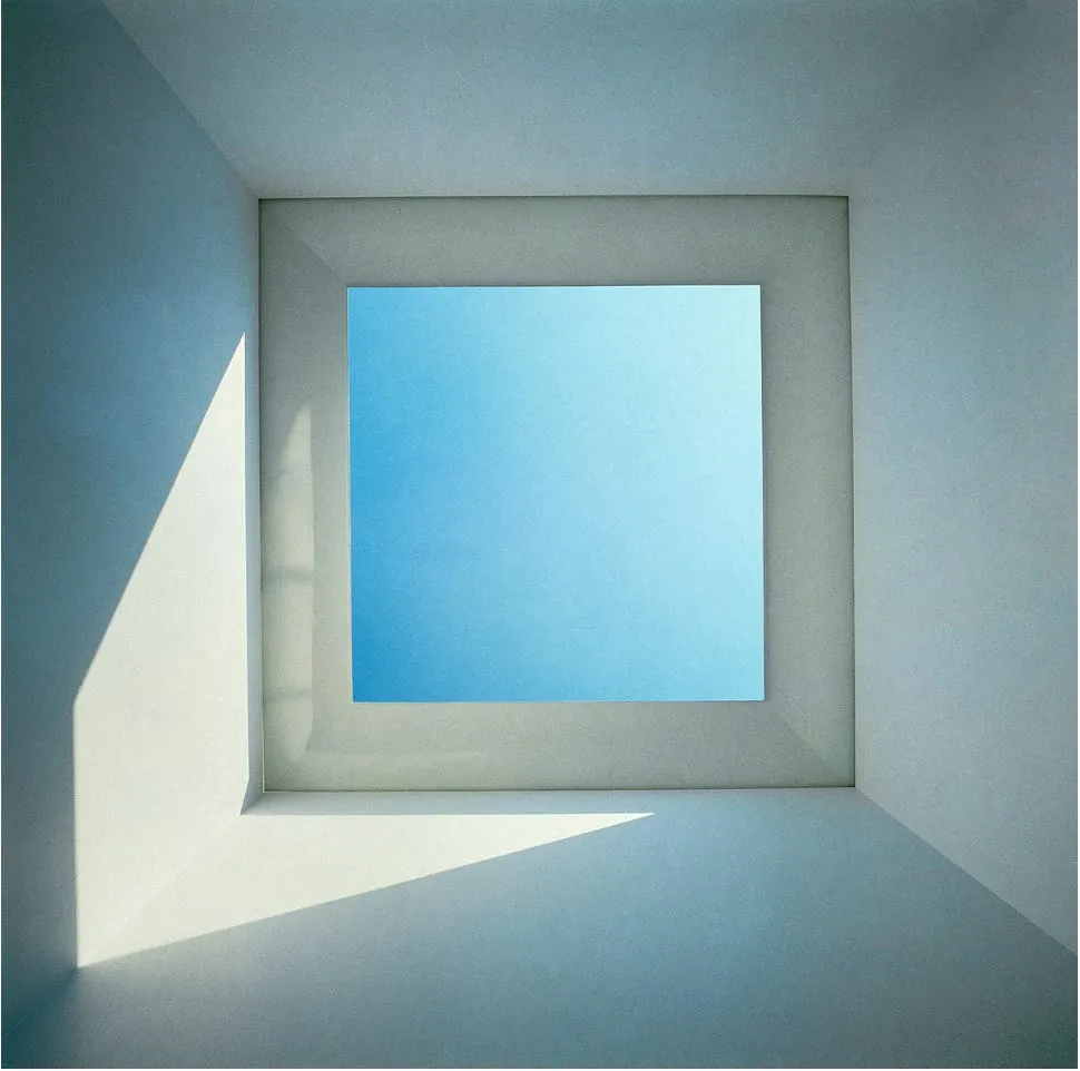
And then there’s the oldest pairing of all: light and shadow.
They’re collaborators in perception. Every painter, architect, and neuroscientist knows it—without contrast, the mind can’t register depth. The right dose of darkness makes illumination feel alive. It’s the chiaroscuro of being human.
It’s the same logic that governs love: the meeting of elements that don’t blend so much as they harmonize.
The Aesthetic of Coexistence
“Harmony and contrast. All beauty comes from these two things.”
— François Vatel
True harmony isn’t about agreement—it’s about coexistence.
In design, it’s how water softens stone without erasing its strength. In architecture, how curve and line share a common pulse. In love, how two distinct lives remain whole while creating something shared.
Harmony is not a resolution—it’s a relationship. It’s the subtle intelligence that allows contrast to become connection.
Final Thoughts
Officiating that ceremony reminded me that you can’t blueprint chemistry—you can only create the conditions for it to thrive.
When Alexa read her vows, she said, “You push me to see the world more kindly.”
He smiled and replied, “You remind me to slow down.”
In that exchange, I saw it: the architecture of complement.
Maybe that’s what a perfect pairing really is—not the elimination of difference, but the devotion to understanding it.
💌 Elle
P.S. What’s a perfect pairing you’ve noticed lately—colors, materials, people, ideas? Share yours in the comments; I love seeing how harmony shows up in other people’s worlds.


.svg)

.svg)


.webp)
.webp)
.webp)
.webp)
.webp)
-min.webp)