
The Color of Feeling
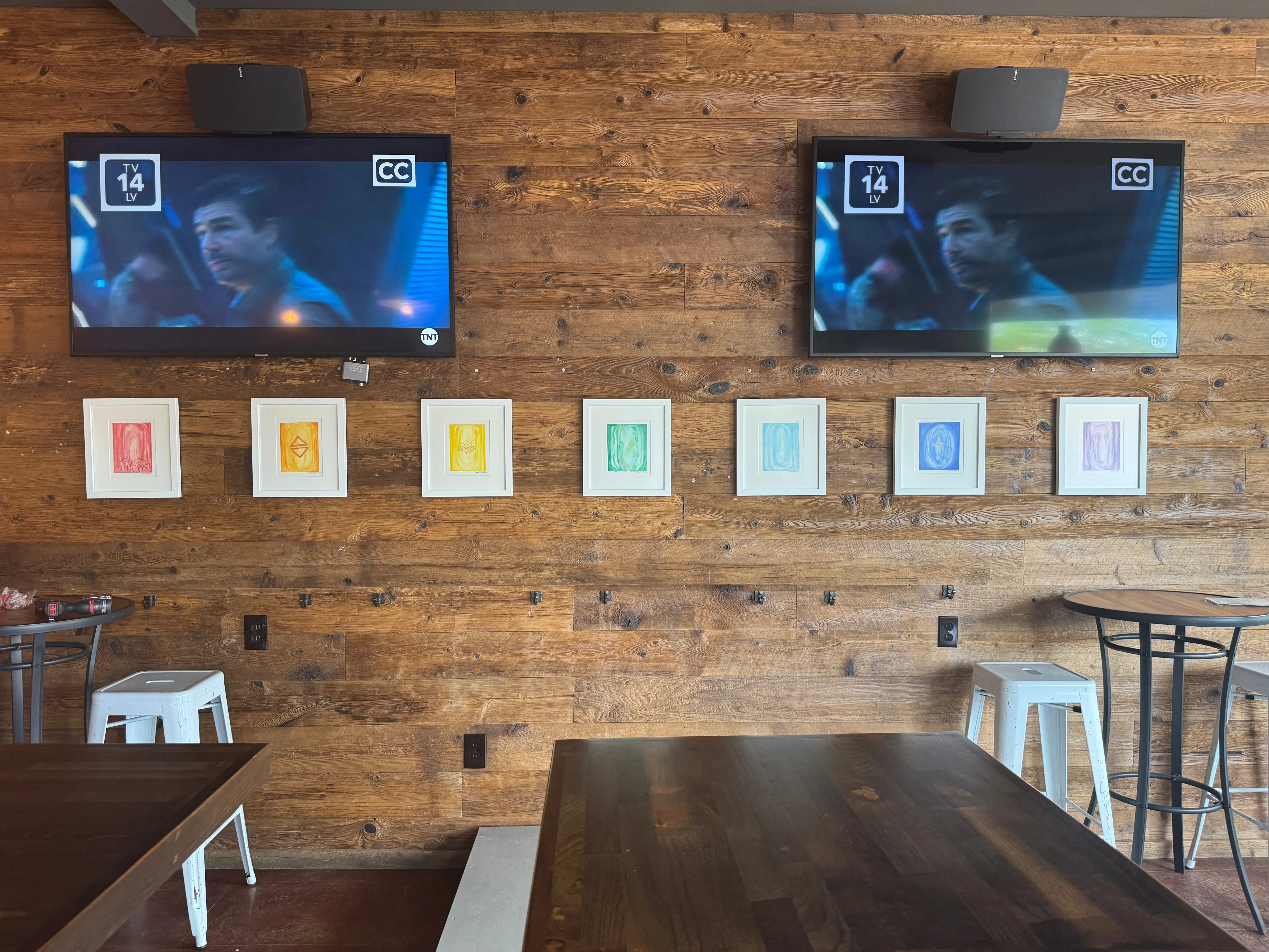
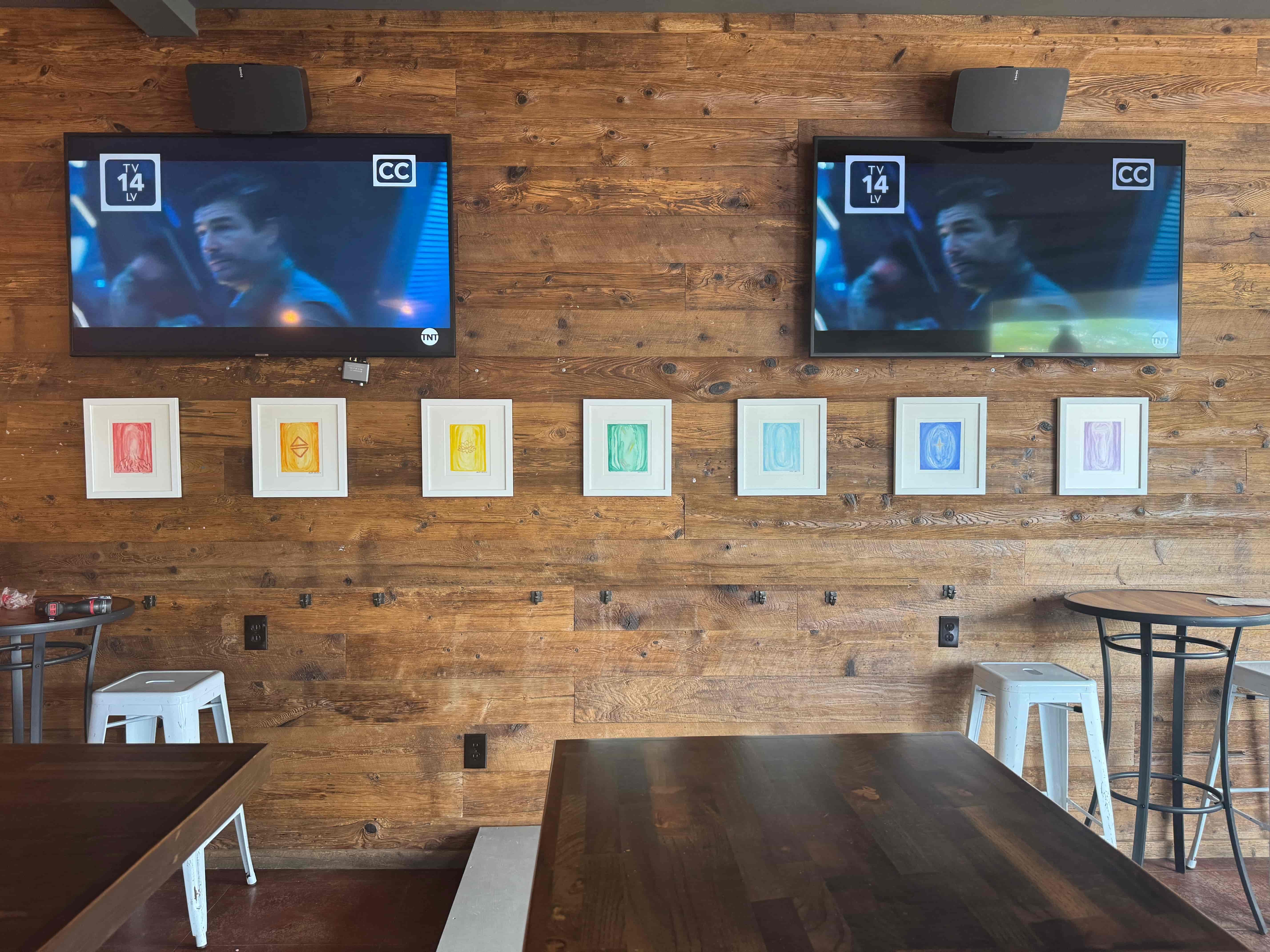
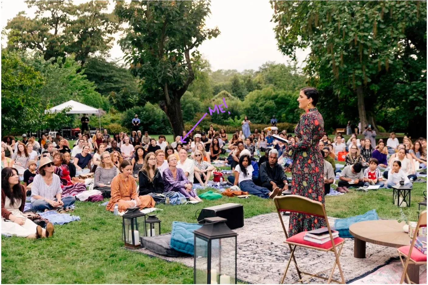
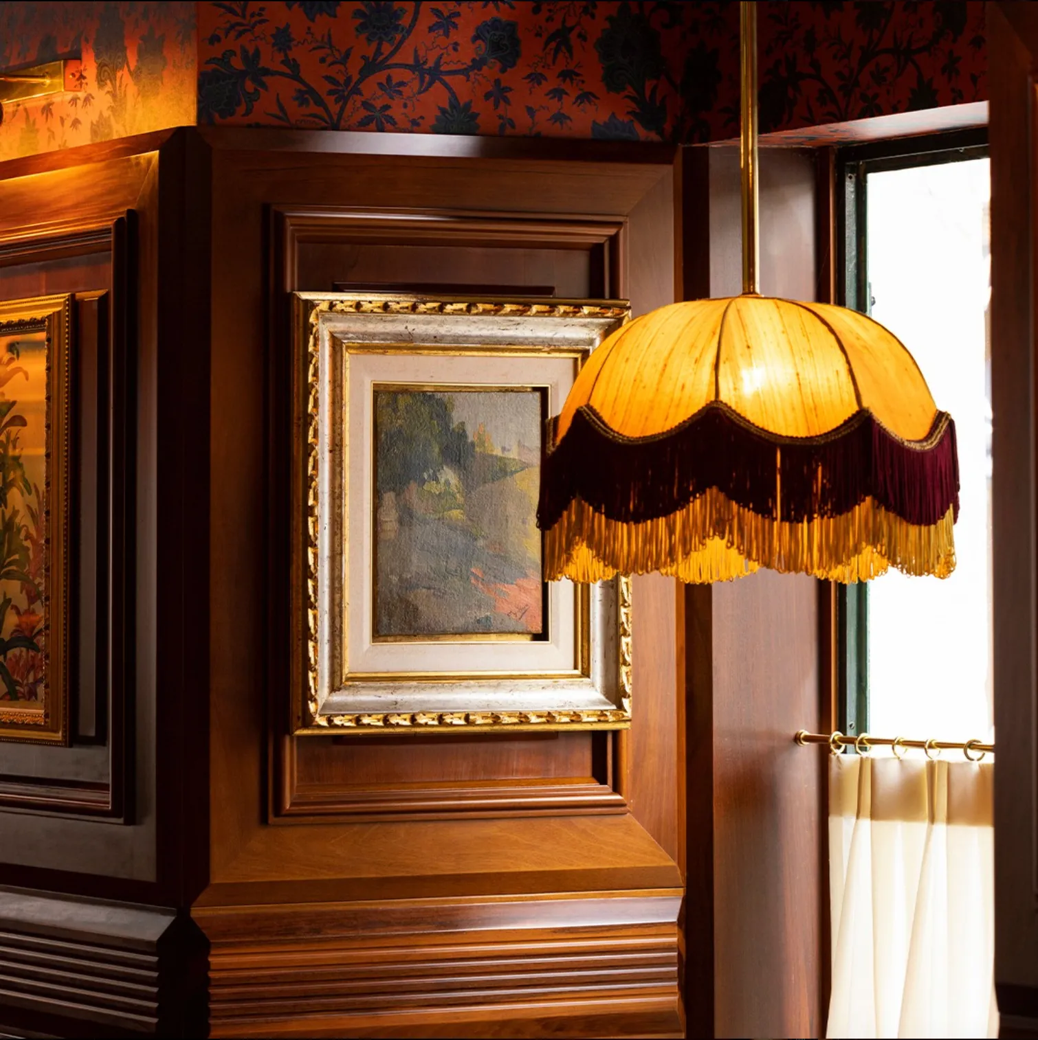
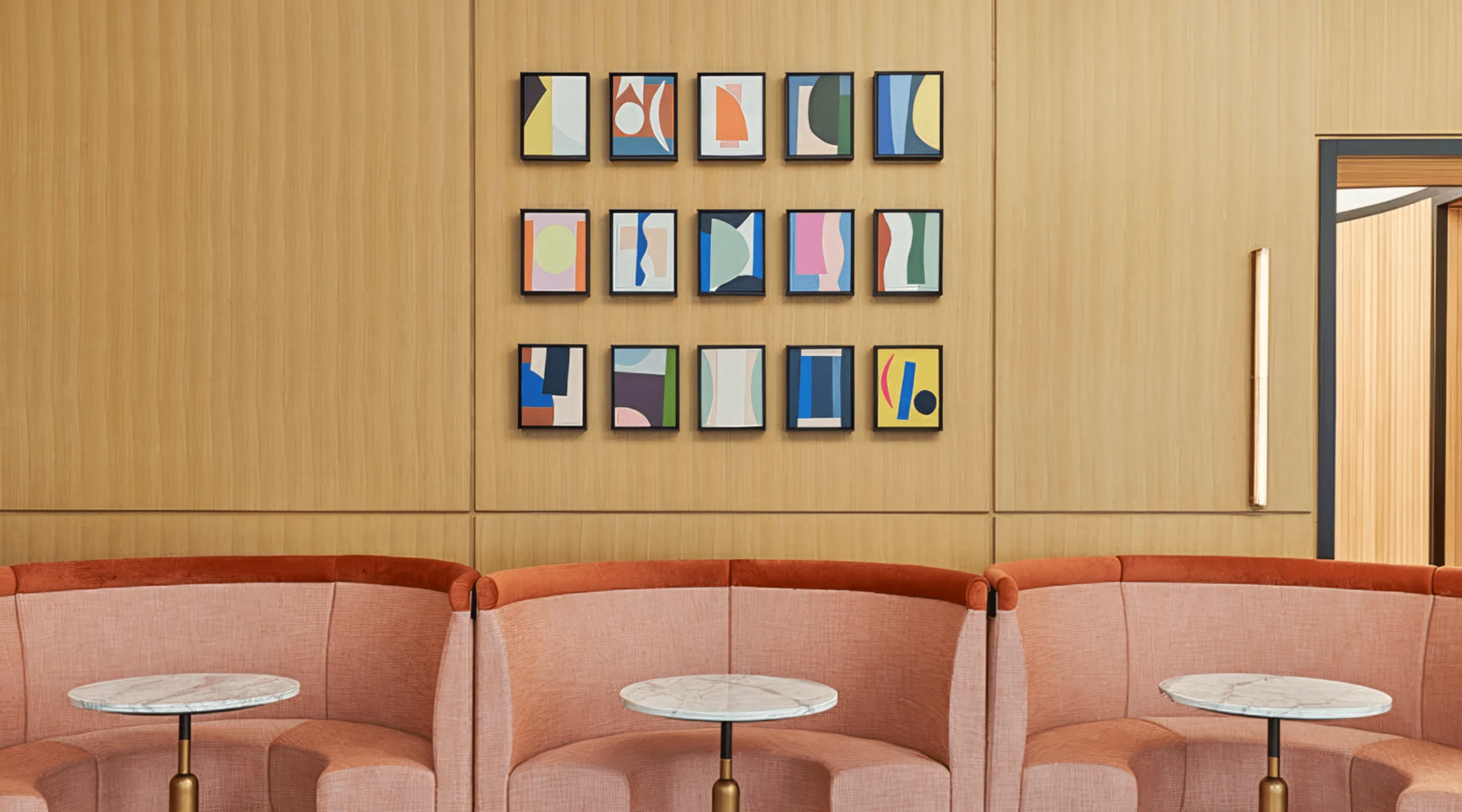
This weekend I installed my artwork in a Hudson Valley bar—my first solo show.
Seven pieces. Seven colors. Seven energy centers.
Hung like a spectrum across a paneled wooden wall, between two glowing TV screens playing mid-day crime shows.
It’s funny where your work ends up—
and how even in a loud space, color can still whisper something soft to the body.
Each piece is based on a chakra—energy centers I’ve long been drawn to, not in a dogmatic sense, but as feeling frequencies.
What it feels like to paint with color
When I paint:
- Red brings me down into the body—into the feet, into stability.
- Orange melts tension. It feels like flow.
- Yellow brings quiet clarity. Confidence that doesn’t need to shout.
- Green helps me exhale—literally.
- Blue clears the mind and the throat.
- Indigo takes me inward.
- Violet expands everything beyond words.
These pieces weren’t about expression.
They were about tuning myself—shade by shade, layer by layer.
What science says about color and the brain
We don’t just see color—we feel it.
“Color is not just processed in the visual cortex—it affects the limbic system, which governs emotion and memory.”
— Dr. Anjan Chatterjee, Penn Center for Neuroaesthetics
Color activates the nervous system in very specific ways:
- Blue tones reduce blood pressure and calm the sympathetic nervous system
- Green aids in emotional recovery and cognitive restoration
- Earth tones create grounding and safety in overstimulated environments
- Highly saturated reds and yellows increase energy and attention—but can also create stress when overused
“We evolved to respond to nature’s palette—sky, plants, earth. These colors signal safety to our brains.”
— Susan Magsamen, co-author of Your Brain on Art
In other words, the colors we choose—on walls, in clothes, in art—are not neutral.
They’re biological cues.
And in New York this weekend...
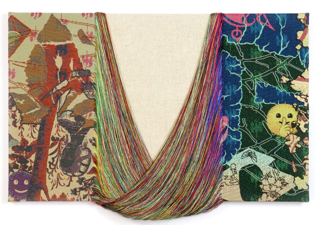
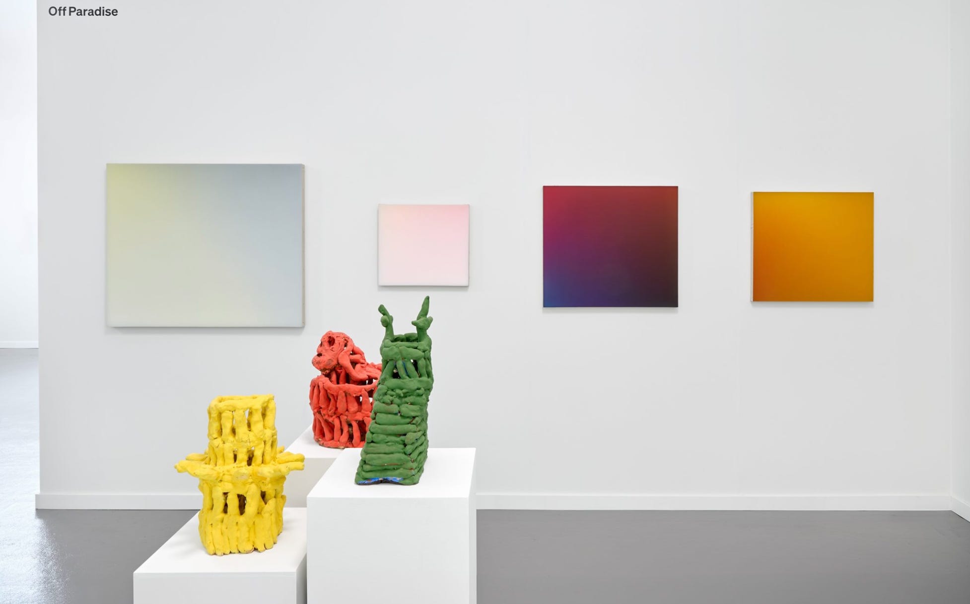
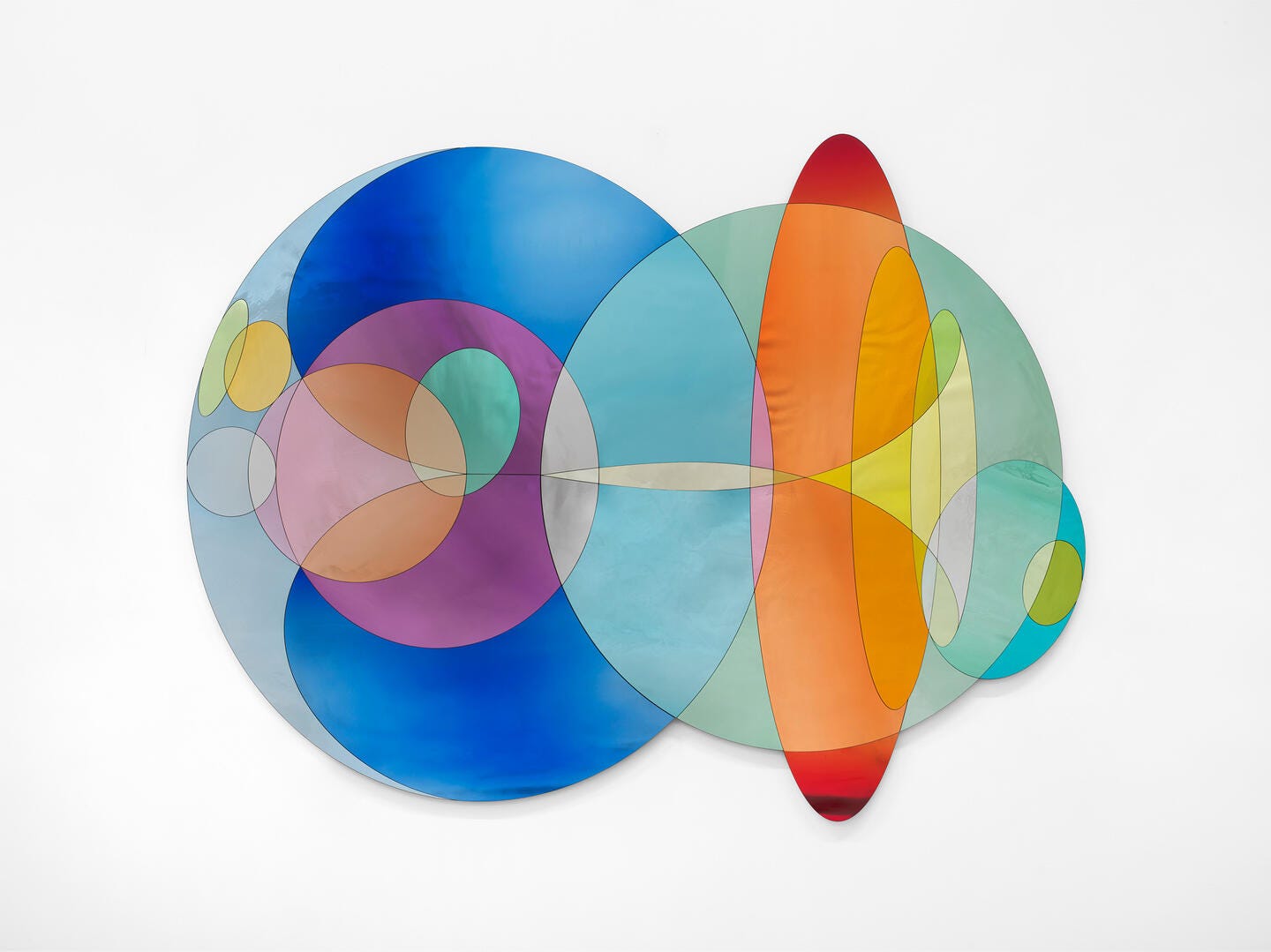
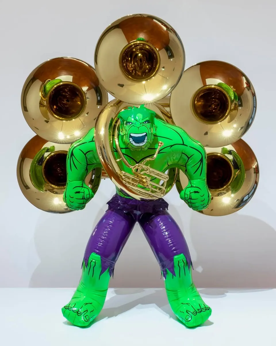
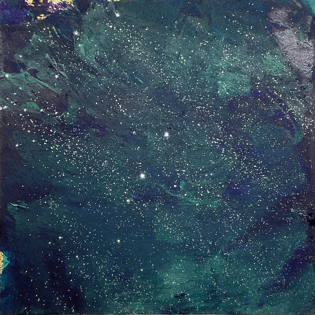
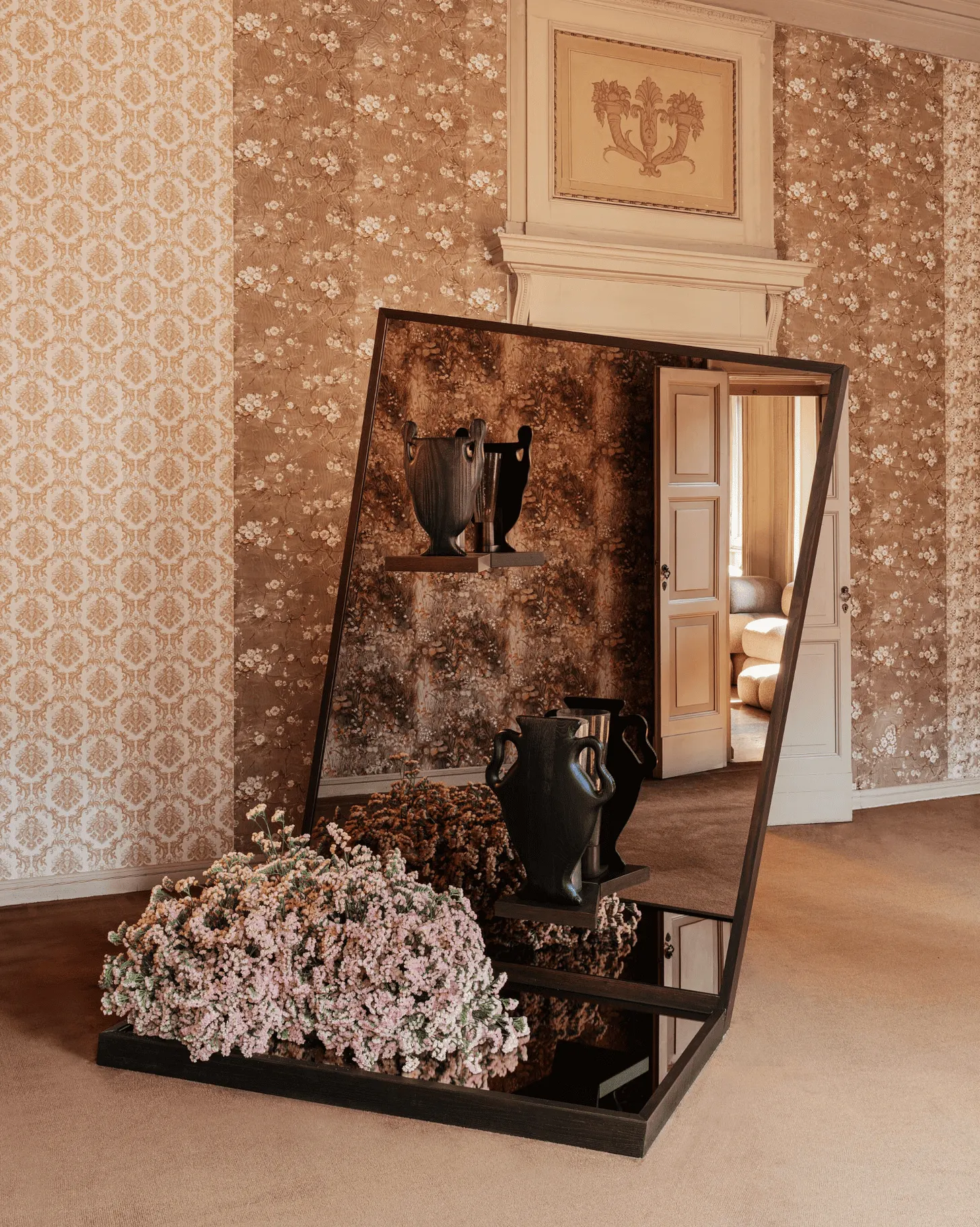
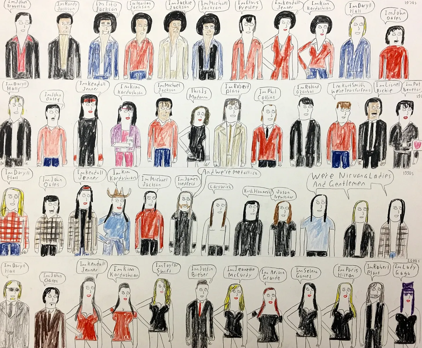
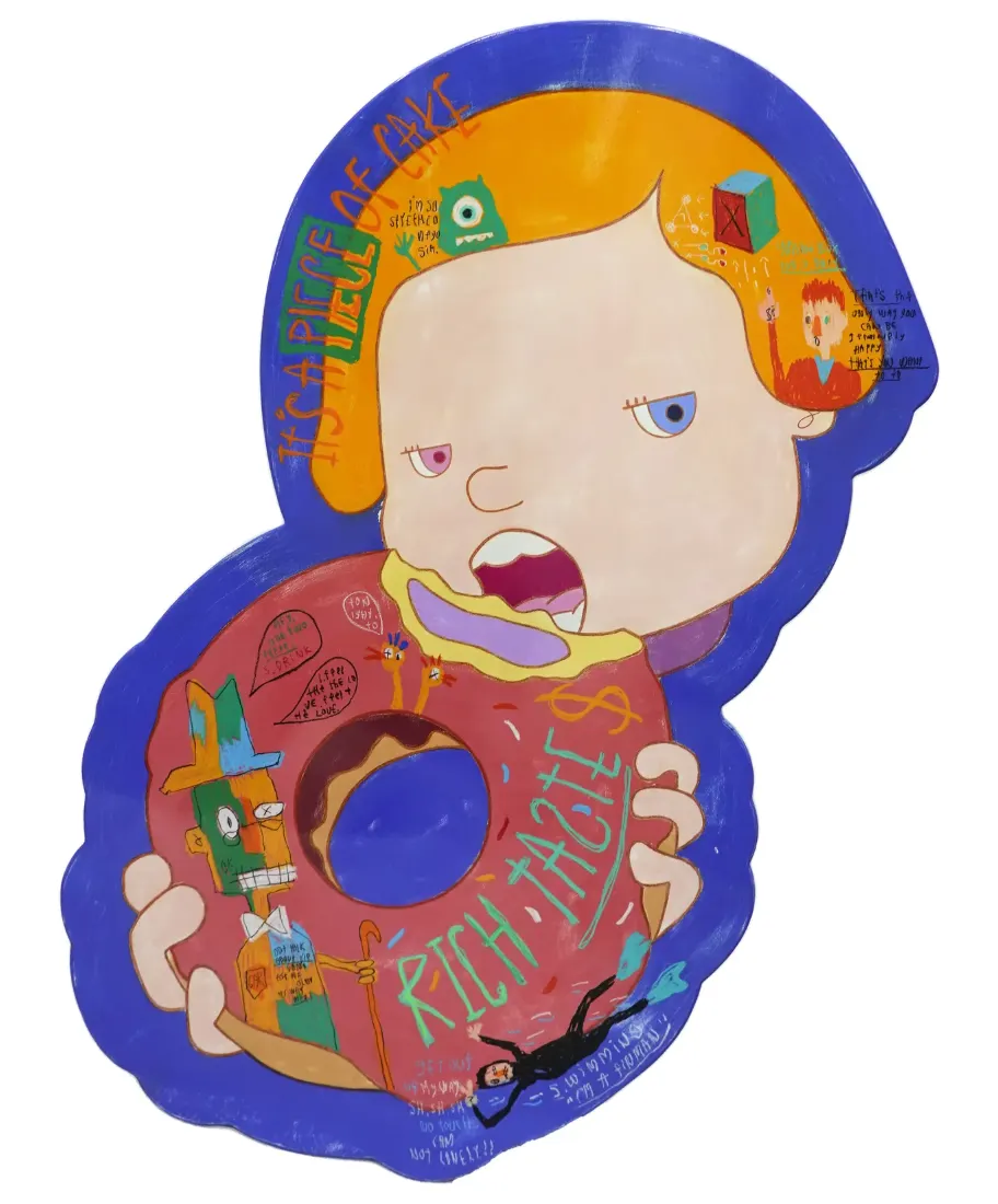
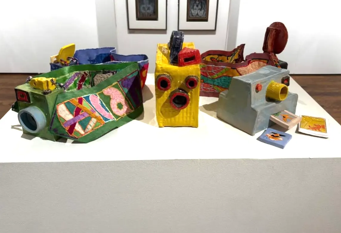
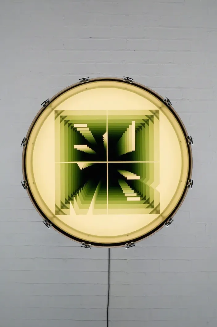
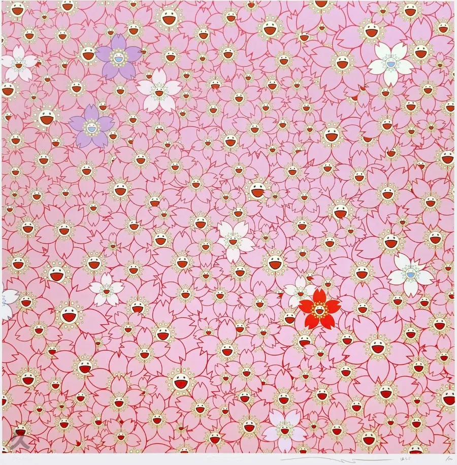
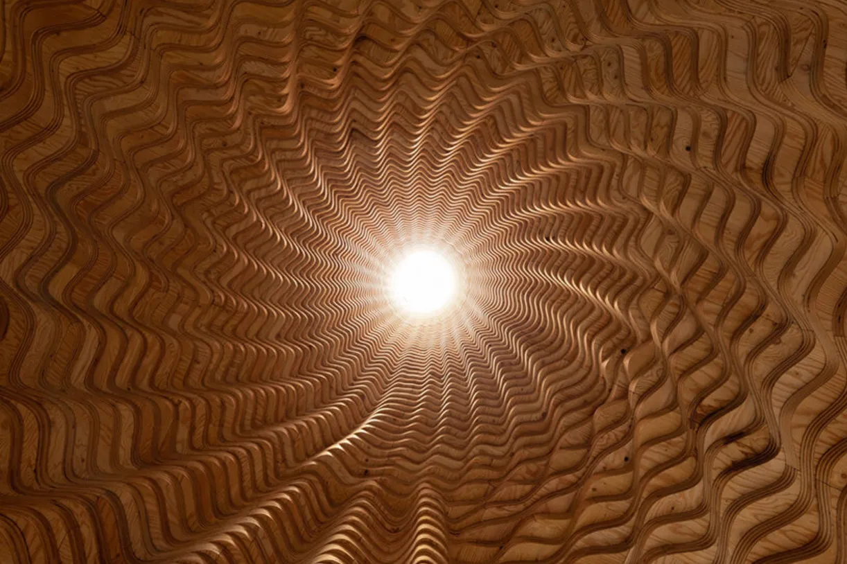
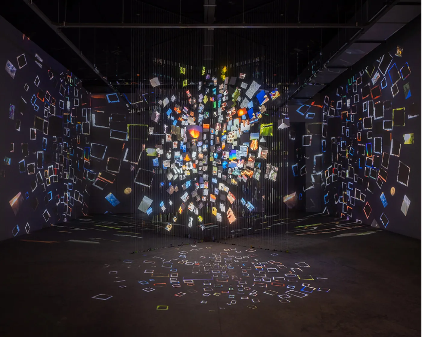
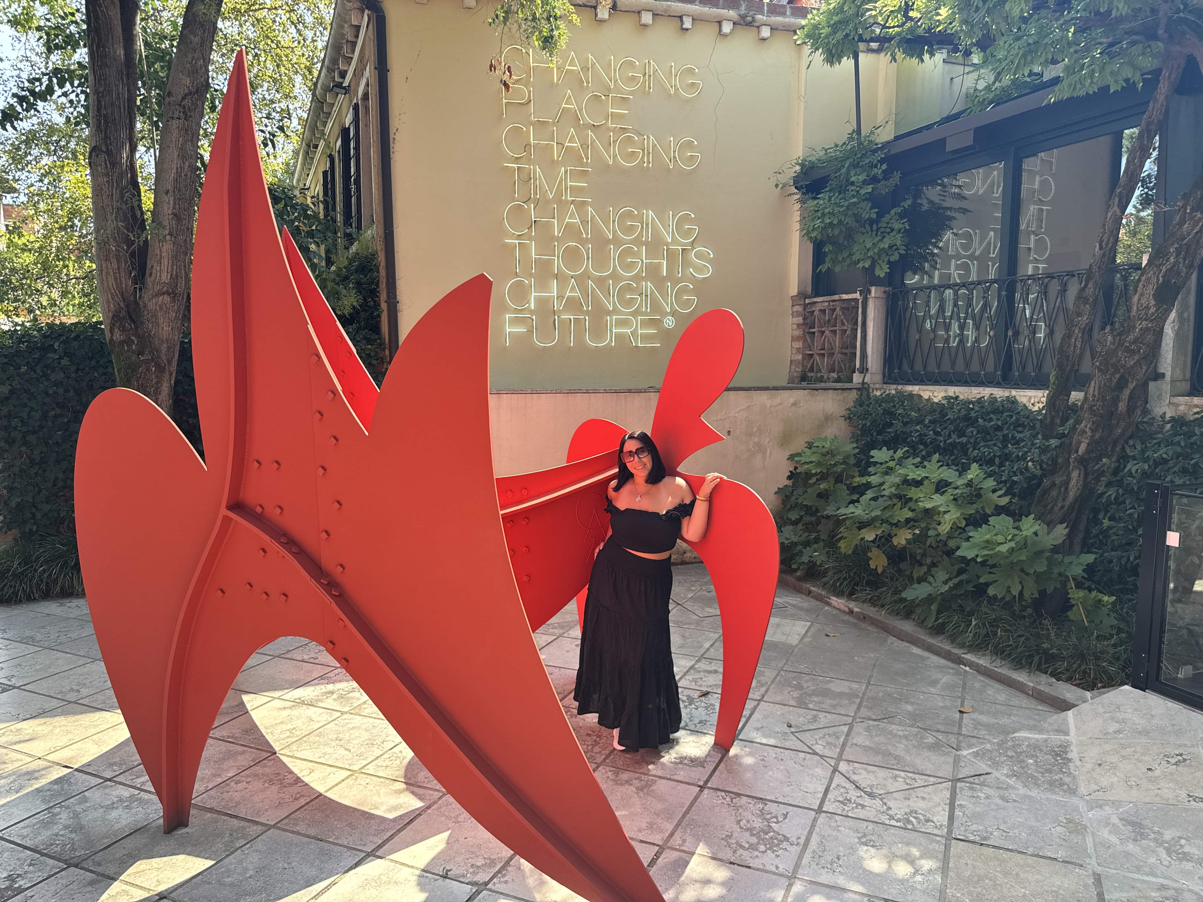
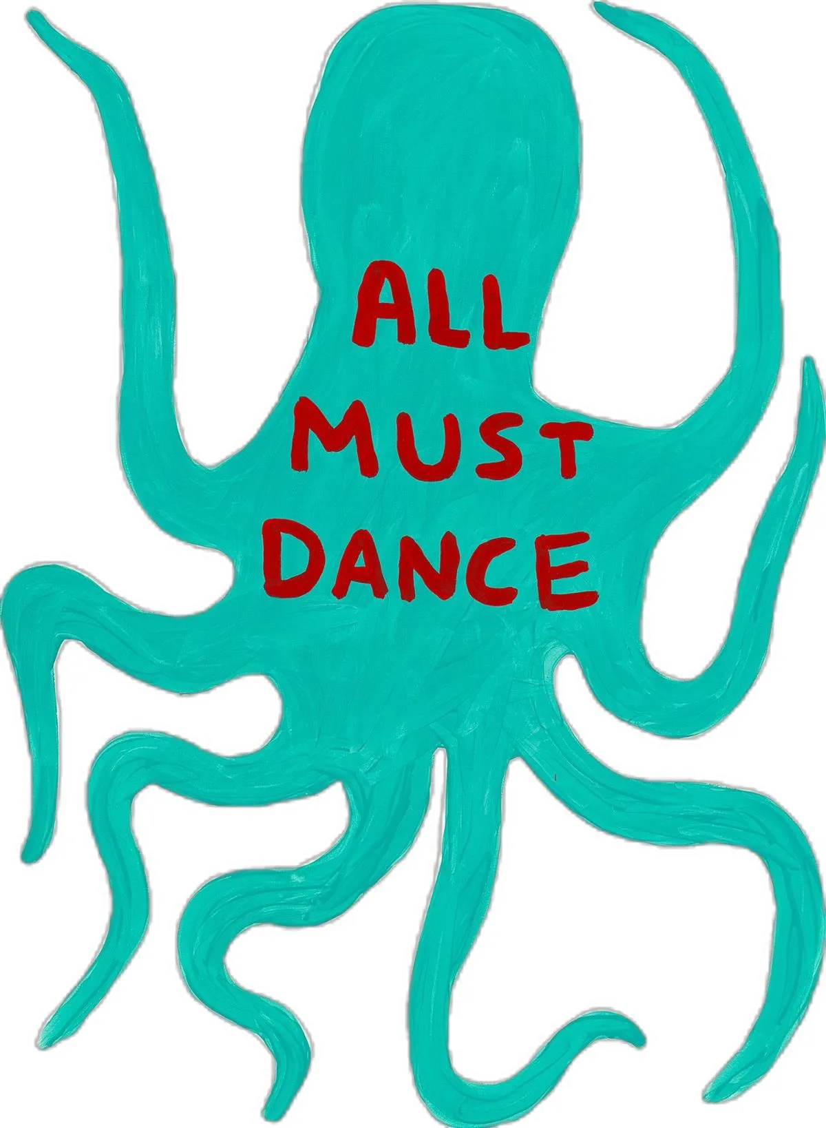
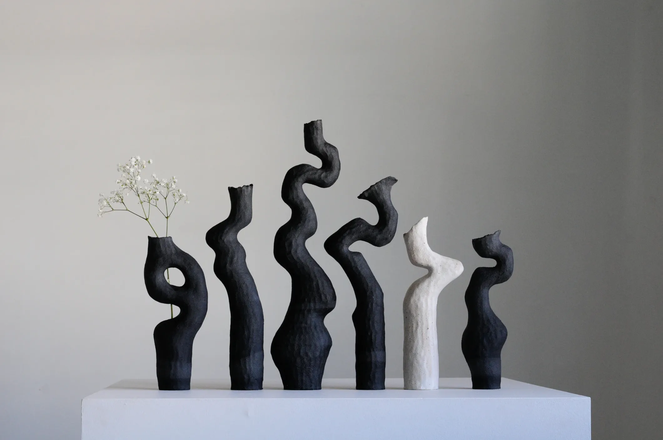
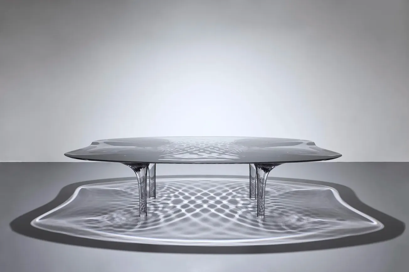
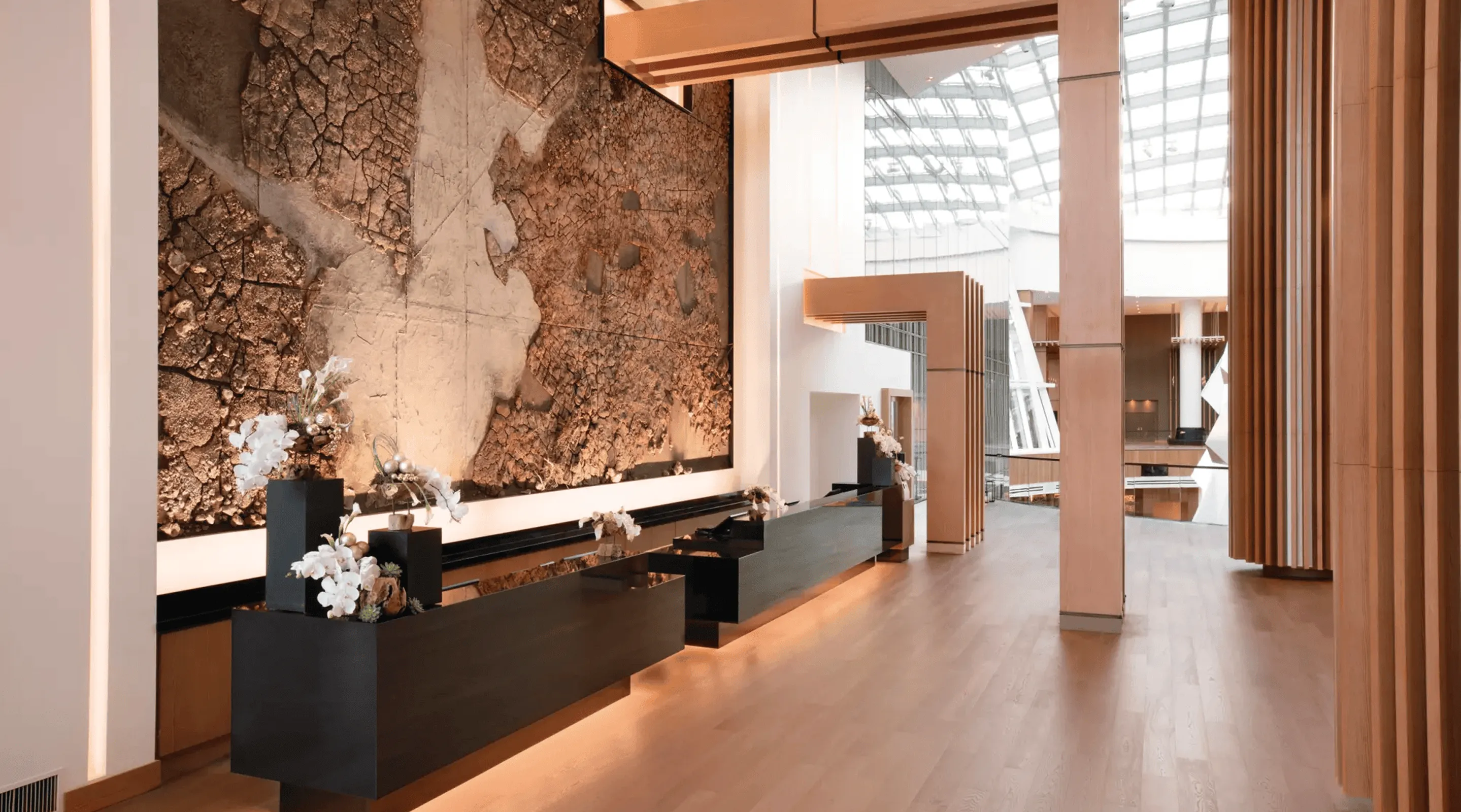
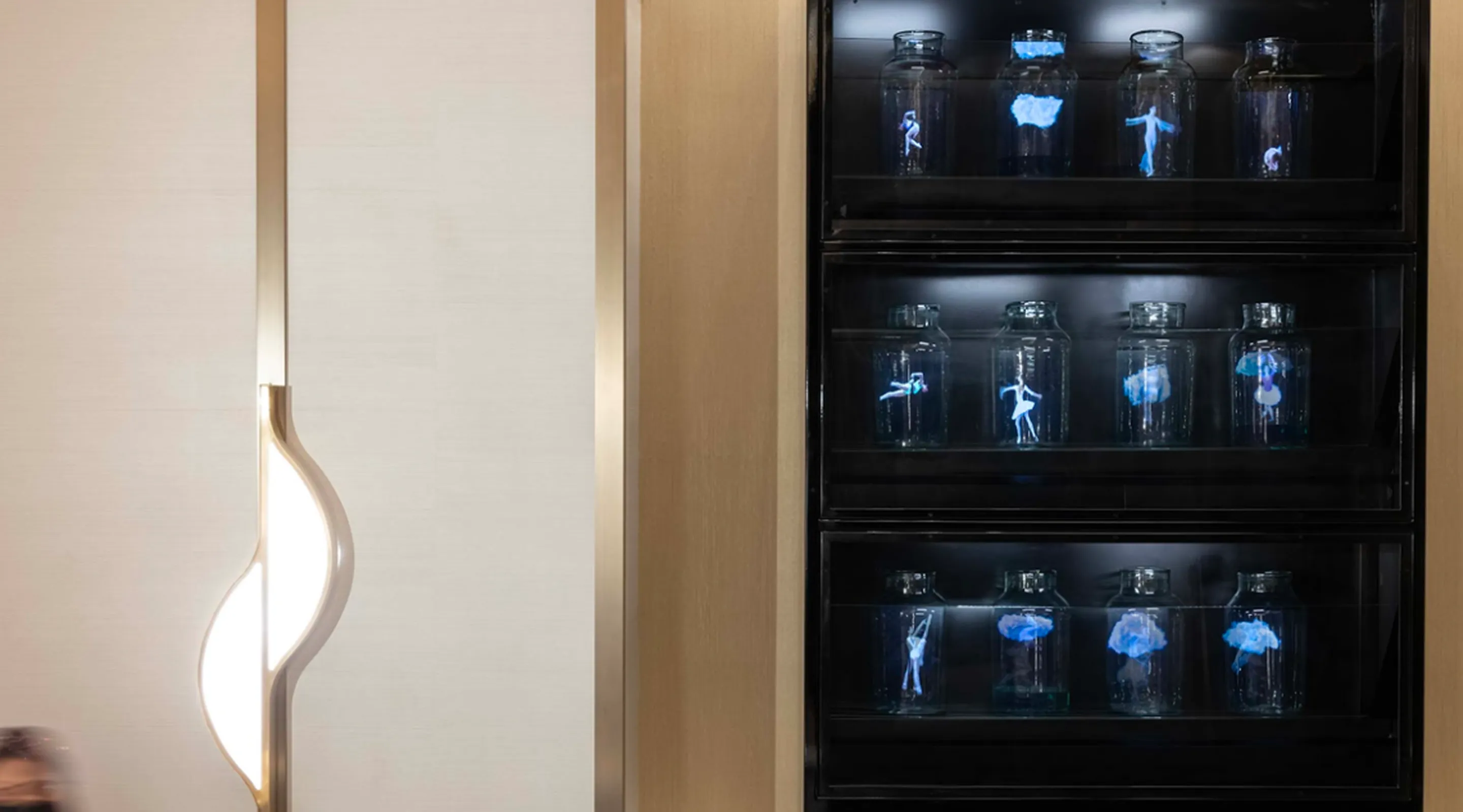
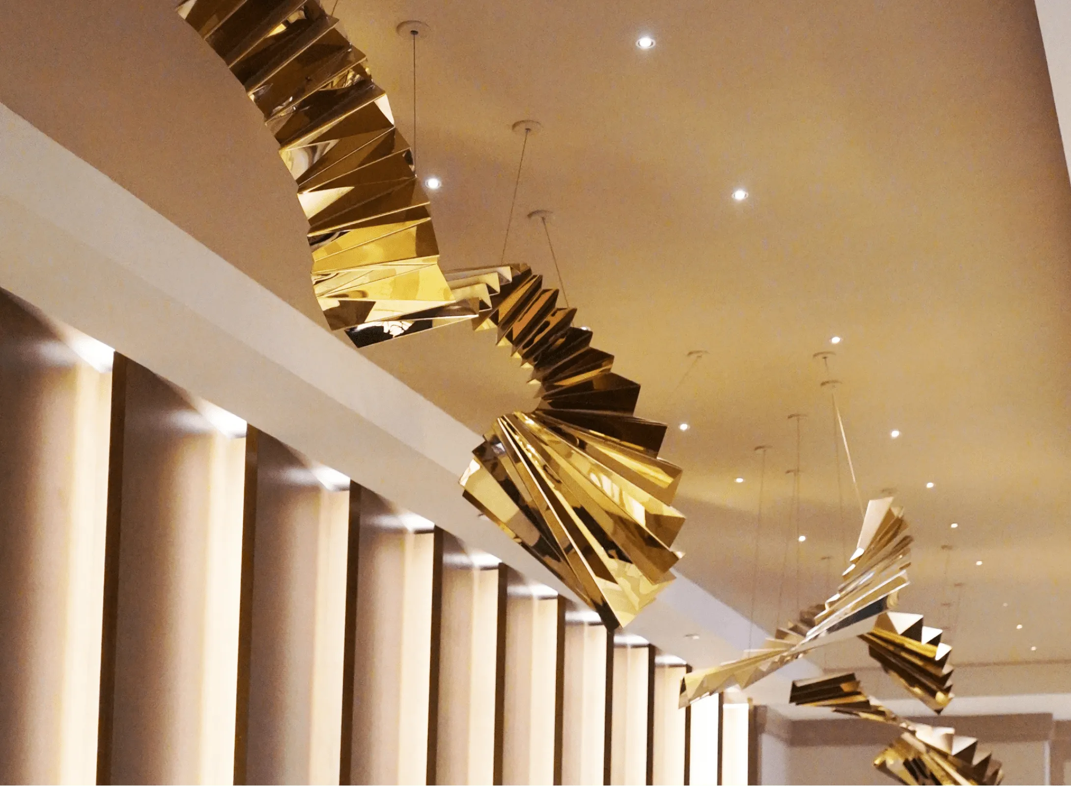
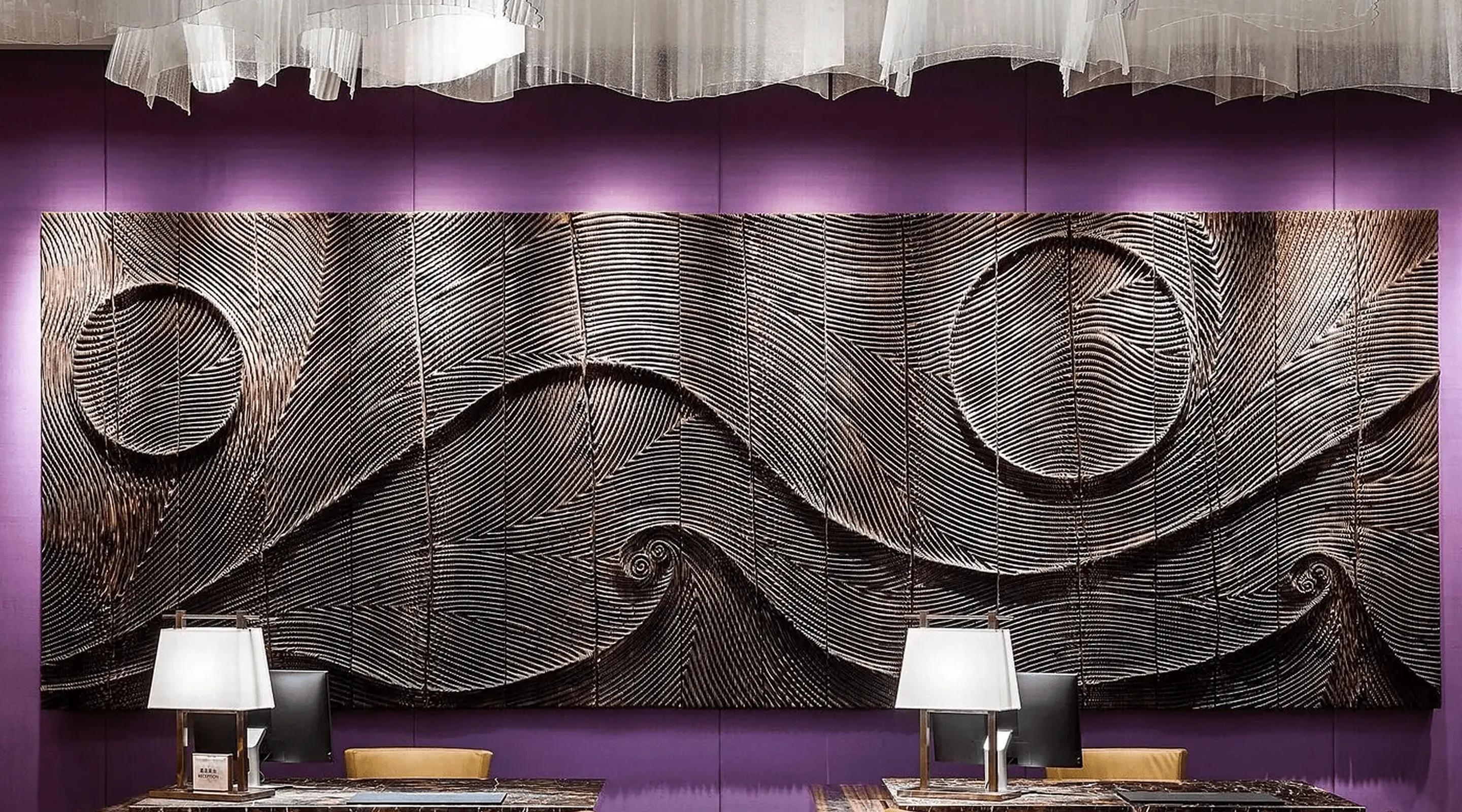
I visited several art shows in NYC. There was no real unifying theme between them.
But one thing was clear: color is back. Boldly. Intentionally. Everywhere.
From luminous washes to full-spectrum saturation, it felt like artists were using color not just to say something, but to shift something.
Not to provoke, but to evoke.
It made me feel less alone in my own practice—like we’re all remembering that beauty doesn’t have to be cerebral to be powerful.
Final Thought
I’ve stopped thinking of color as just a style choice.
In design—and in life—it’s become a signal.
Of what I need. Where I am.
How I want to feel in a space.
Good design doesn’t start with a palette.
It starts with feeling—then builds from there.
💌
Elle
P.S. My NYC art show review drops early next week—highlighting the trends, artists, textures, and colors that stirred something real. It’s part sensory log, part visual notebook. Contact me for more details 😊


.svg)

.svg)


.webp)
.webp)
.webp)
.webp)
.webp)
-min.webp)